“We spent so much time building this, but it’s surprising the feature never got used.”
Quite often, product teams end up thinking this. It’s understandably true that products are hard—to be dreamt about and shaped to solve for a need. It’s a great achievement to be able to conceive ideas, work on timelines, and bring out the product together as a team to the market. But, what never stops is looking at the usage of the product with the lens of the effort you’ve built with.
But product is a lot of effort
Everyone talks about how a product should address a problem to find its market fit, and of course teams do evaluate needs, shape hypotheses, and run strategy discussions before finally launching products. So much involvement in terms of commitment, taste, and time is spent and naturally every product person wants to feel invested with this kind of work.
The journey however is sure enough to cover some of these thoughts:
“Looks like the users haven’t visited this step at all. But this is kind of crucial to our activation flow.”
“We’ve revamped the screen and made the CTAs more evident, but why haven’t they still clicked?”
“This feature is super easy to notice on the dashboard, but daily engagement is abysmal.”
Solving for customers and taking pride in the product effort we’ve put in could definitely lead to disappointment when it doesn’t work out. But, only very recently, I was reflecting on something—does the effort get measured as the same (as effort) at the user’s end too? Unfortunately not!
Your effort = User energy
If the LHS is your team effort in building this product considering it’s aligned with the market requirements and immediate needs, the RHS isn’t going to be users’ efforts in using it. Much prior to that comes a user’s energy level while discovering your product or feature. What people call as good and bad UX is dependent on how much of an energy waste or gain the whole experience has been.
So, for once, instead of wondering why our team effort was wasted, let’s think about whether the product has been energizing or draining for the user. What we call as activation or retention is ultimately the user’s simple judgments to whether they trust in your product, feel convinced about it, and understand why what you provide is the best they can find—all without compromising their energy.
Design here plays as an elevator to help the users take notice of their energies, but they only act as levers. An energy-draining user experience cannot be saved just with an excellent UI.
How to ensure what we’re building also builds up users’ energies
– Counter centrifugal approach: The same idea built into our feature roadmaps as “must have” and “nice to have” can be thought of in terms of usage patterns too. Think about the steps a user will undergo in completing that action and group the ones where a user might spend more time and energy (frustratingly). Now, either see whether you want to eliminate some of these steps or advance them in a way that feels like you’re buttering with a hot knife. Start with the centre goal and turn everything that moves away, towards.
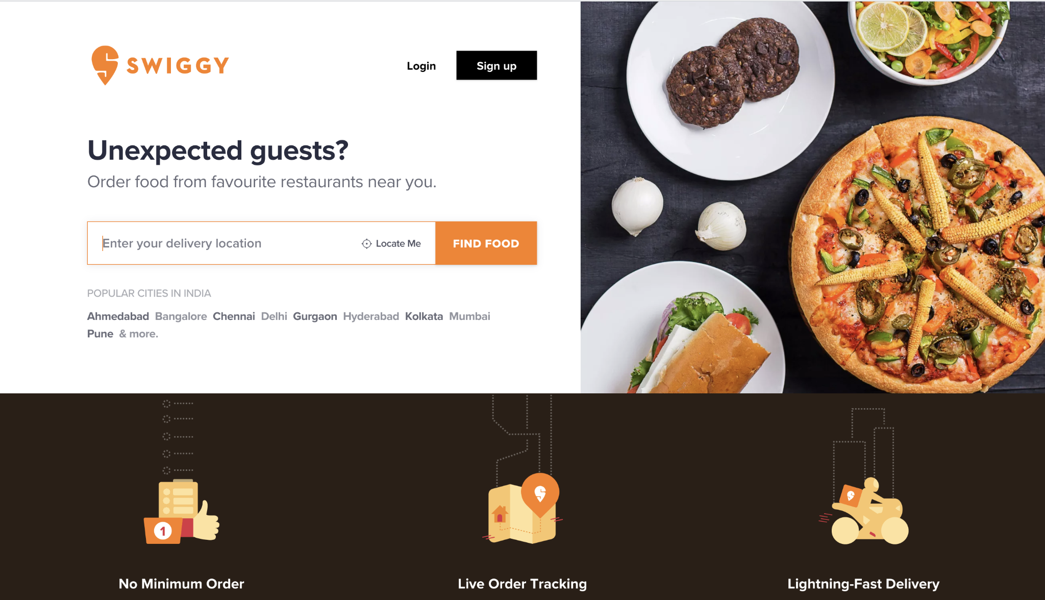
Eg. To find the best food quickly, it’s enough to just use a user’s location. In some cases, they might log in and only then try to find the closest restaurants. But by ensuring both of these actions i.e. login with phone number and location permission aren’t simultaneously required, the brand has amped up the user’s energy levels (read energy saved).
In places where fields can be broken down, do so. But, in cases where you’re overwhelmingly collecting random information, group up.
– De-risking for what the user wants to achieve: This means you try to use a combination of data-informed decisions and intuitive taste to decide why a certain something might work good (energy) for the user. A reminder from Cody Evol’s (Product Design Director at Eventbrite) logic on how to build various stages of the product:\
“The level of investment before something reaches a customer is tied to how confident we are that we understand both the problem and viability of the solution.”
If that button you are adding is never tied back to a core action, collects unwanted data, or exhausts the user with yet another thing to look at, it definitely doesn’t address the viability even if it seems to solve a problem. Solving shouldn’t come at the expense of a user spending energy inside your product unwarrantedly.
I recently noticed this small attention to detail in the Mi Fit app, that clearly accelerates the product login without draining the cognitive energy of the user—mentioning the last sign-in method. Here it ties to the core action of a user mapping their watch with the app, goal of signing into the app, and doesn’t collect unwanted details or takes the user through multiple attempts of “looks like you have an account” or anything. Neat and easy.
These days, I’ve started to think in terms of how to save and multiply users’ energy levels in the place of saying why a particular feature isn’t used much. It might not help in all situations, but the mindset as it is helps you discover a lot more about user perceptions, of all mainly that “your effort to build = user’s energy to experience.”