It’s for a reason that product people often refer to a users’ way of getting through a product as “habit.” Because using a product, understanding the merits and pitfalls, and beginning to stick around with it could definitely feel like building a new habit. And, based on a number of attributes like depth of understanding, prior usage of similar products, and strong conviction in the problem a product solves, most users have an edge over the others who may just try a product out of curiosity or pleasure.
In an interview with Narandas Desi, Founder of Wagh Bakri tea, one of India’s oldest brands, he jokingly said if sometimes the tea turns out bad, people never question the other ingredients like milk and water—it’s always the tea at fault. He also mentioned how amidst all of that, it’s important for his brand to be rightly serving customers who may have different tea habits and preferences all across the country.
This anecdote gets pretty similar to the users’ product habits as mentioned earlier—the fault always goes to the product, though it could have been the user’s misunderstanding of a feature, incomplete picture of their problem, or skipped level of judgment. It always comes back to the product! And, as product people, it’s important that we proactively figure out some of those conceived and existing faults, before even users could chance upon or face those.
From personal experiences, I’ve also noticed how little attention most users have even with reading instructions (they could exactly end up doing what you wrote instructions for not to do) or completing actions (hail abandoned cart messages). Studying user experiences can tell us that often figuring out those unseen faults is all about closely watching these three things—discoverability, usability, utility of what we build.
The good news is finding these faults yourself is like thanking your future self and avoiding the happening of a user pointing a fault on your product.
Mostly, users end up finding bottlenecks when they can’t find the way to do something inside a product, or when they have friction in achieving their goal, or when they deceive themselves into thinking something is of value for them.
[I have also earlier written about the power of opposite thinking which by default wires you into thinking how a user will not do something or will find faults with something, which pushes you into fixing stuff even before they come up]
Case: You’ve disguised the purpose by default
This is the case where something instrumental for users such as features, options, and buttons are well away from the place where users will be able to figure out. Obviously, when we think of situations wherein we’re the users of another product, we likely skip steps that we aren’t sure to see.
Sometimes, it could also be something you unintentionally keep out of reach so the user will never be able to complete their actions—just imagine the number of times you’d have clicked back or forward motions in apps to figure out an option you already wanted to see.
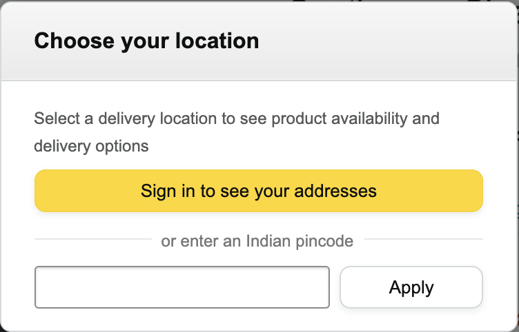
Alternatively, this is exactly why products that depend on certain key information to deliver results end up showing the necessary options from the start, with options to needfully skip certain steps. How a simple pincode option is added to see how fast something can be shipped to us before we even add it to the cart, is an example of why a key feature shouldn’t be kept out of reach from the users’ eyes.
Some questions to think about for checking discoverability:
1. Did you keep any crucial option/feature/step out of users’ sight?
2. Is there any information or detail that you can show users, right before they wonder what to do?
3. Is there anything that’s proving hindrance to some features from being discovered? [Sometimes, this could be another feature or any unintended step that could be removed]
Case: You’ve worked up the otherwise simple actions
Imagine all those times when you carefully filled a form only to see find some erroneous step washing out everything you typed? Or, even worse, after having spent all your energy into providing the details, there’s no ‘save’ option to come back to? These are still prevalent, though not too frequent, in many products and apps.
But a worked up flow needn’t be as obvious and bad as these mentioned. It could end up bad even though it wasn’t designed that way. Like a tedious flow to complete a process or misplaced options that make the user take multiple steps (and minutes) for navigating across.
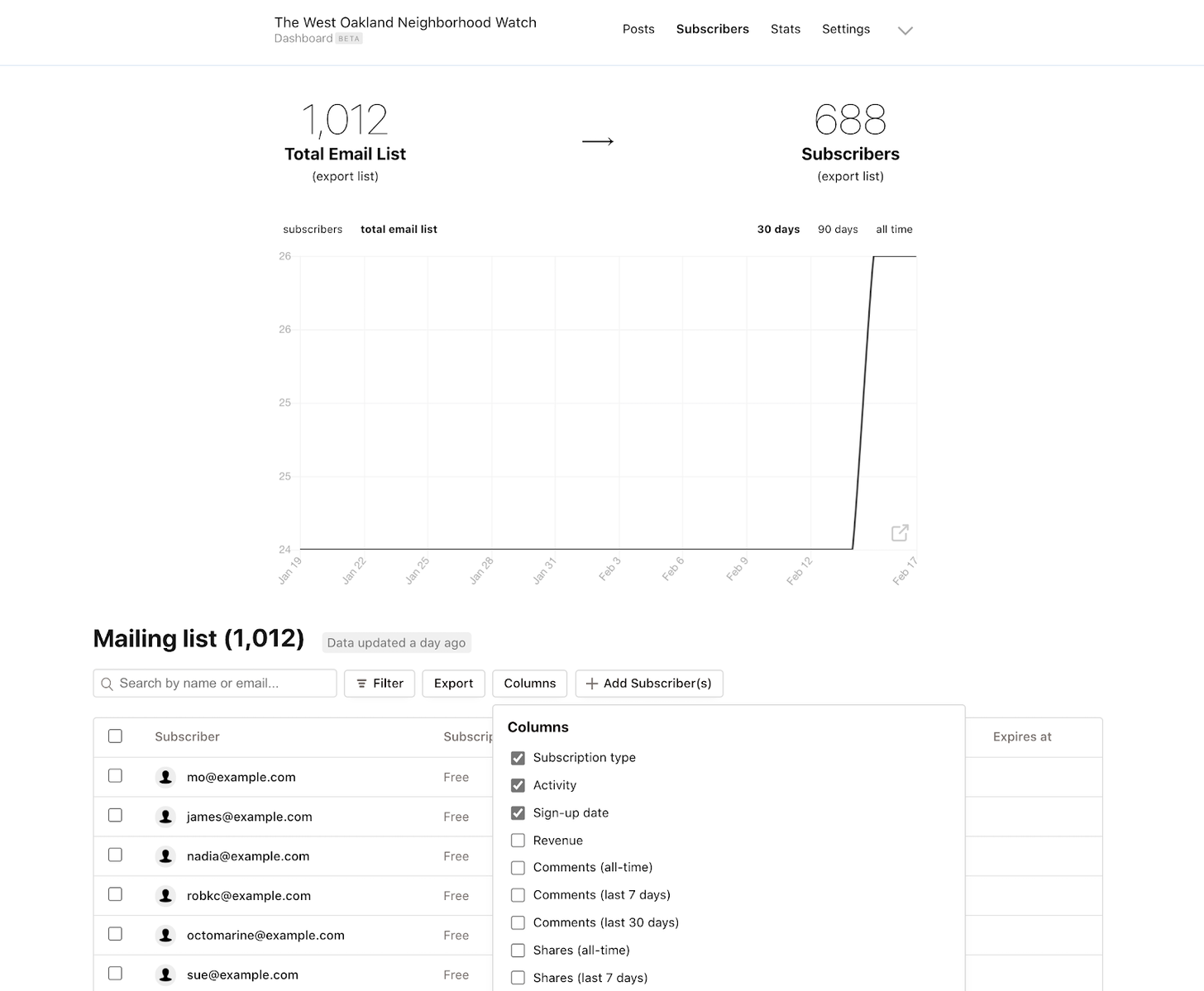
Before:
After:
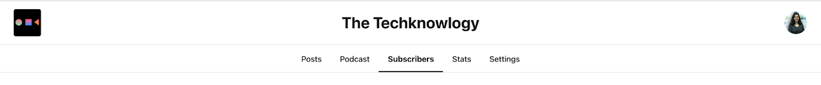
Substack’s recent changes in the way the dashboard looks perfectly fits this example. Earlier, it wasn’t a clunky UI, but understanding the navigation from seeing the lists of written posts and podcast posts, to the dashboard, and thereby switching to other tabs and settings, was definitely taking some minutes. Now, revisiting their focus clearly on helping writers set up a writing website, Substack has visually made the look and navigation simpler, with a clear UI, separating the podcast section too. \
Some questions to think about for checking usability:
1. Are you asking for too much energy from the user’s side without real benefit? [like making them fill unwanted data]
2. How long does a user wait to complete an action?
3. Can this flow get simpler than what it currently is?
Case: You’re not blowing your ‘purpose’ trumpet at all
Websites are always considered the primary source of everything related with the purpose of a product—pages, solution sections, testimonials, all of those give a detailed view of why to use a product and how to benefit from it. But, bringing the core purpose right inside the product, constantly helping users understand why they use what they use, and helping them build trust around why this product brings value to them—that’s exactly what makes up the jargon, ‘product-led’ growth.
What’s celebrated is scaling up features and rolling out new options, but evaluating the level of a user’s conviction and belief in getting value out of the existing product as well as reminding users on the fastest (and simplest) way to do better are under-appreciated.
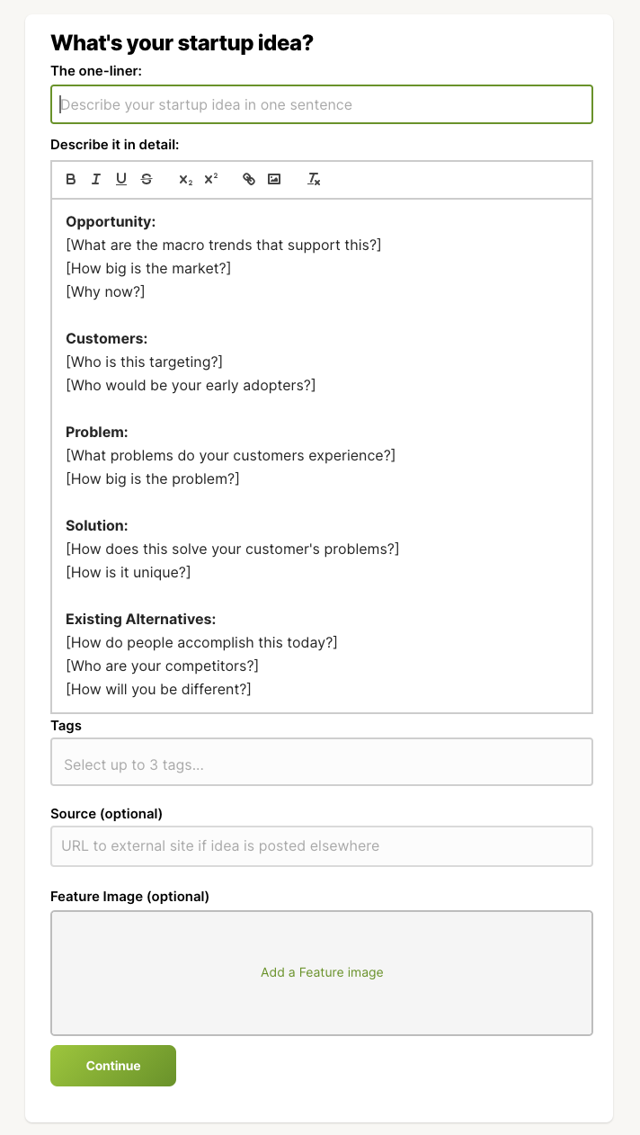
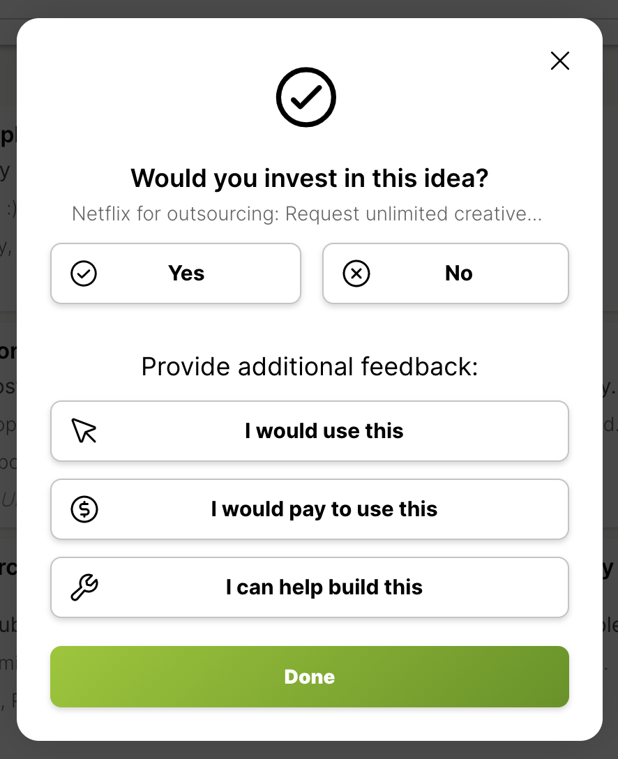
Kern.al has been a recent favorite platform in bouncing off my ideas and trying to see what goes on in others’ minds. Whether someone is a first-time user or has been using the product for days, what’s remarkable is when you plan to post some ideas, there’s always a reminder about how you can structure your thoughts—in the best way a reader can understand. Got stuck or don’t have anything to post? There’s still value for you, and the product deftly reminds you to check out “Trends” wherein you can get inspired from an idea bank and pick what works for you. Upvoting something? You can help someone with additional context (or you get details if you’re the idea owner) on whether you’d use, invest, or pay for this idea. Pretty much at every step, the product aims to educate a user on the value they’ll get, every time they navigate through.

Some questions to think about for checking utility:
1. Is your user doing better off if this feature/product isn’t there?
2. Has this feature been neglected even after many reminders?
3. Are you/your team talking enough about this feature to your customers?
4. Are there cues in your product that help users navigate even when stuck?
So, are all of these a customary one-time check? Definitely not. These are like checklist items that we often have to look back and analyze, every few months, just so we stay on track. The more we get better at tracing through some of the visible and invisible faults, the better we can anticipate users’ experiences and satisfaction. It’s all a continuous learning we embark on!