Attention is a scare resource in the NFT space. Attention flows can be quantified by mining blockchain transactions. I worked with wgmi.io to build a data application for quantifying NFT ownership over time within the PROOF Collective.
The app can be viewed here and its features are described below. Because the 1000 member PROOF collective holds ~8000 different NFT projects, we use user-defined filters (top), which can make it easier to view and interpret the table. We also include an easily sort- and search-able AgGrid table for displaying the results (see image below).
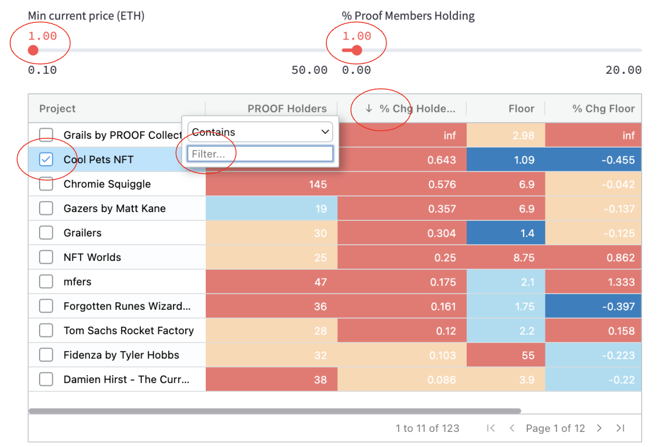
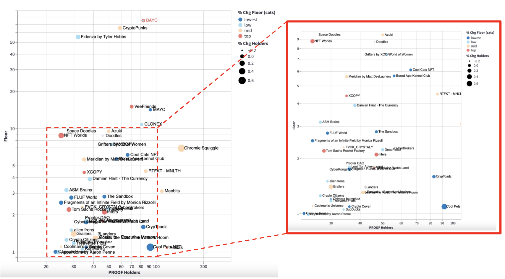
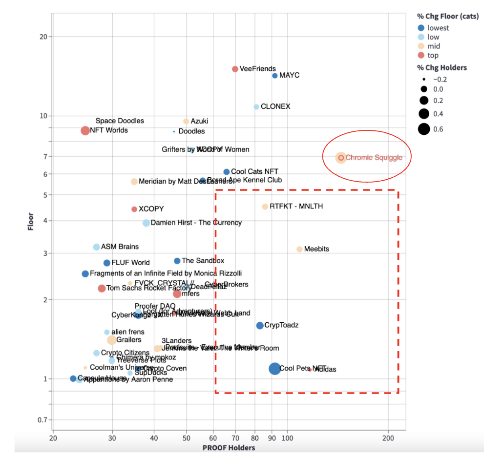
Any row in the table can be selected (e.g., Cool Pets). The selection will be highlighted (in red text) in the Altair scatterplot below the table (see below). The plot displays the same information as the table, but with marker color showing the categorical change in floor price and marker size showing the change in PROOF holders over the time interval. It also allows interactive zoom to explore specific regions of the data space.
Usage can address several questions:
- What are the most (or least) owned projects? Filter the table on Holders.
- What are the most recently purchased projects? Filter the table on % Chg Holders.
- What are “good value” projects? Scatterplot lower right (low floor, high ownership).
Over the dates shown here (03-12-20022 to 02-22-20022), Squiggles saw a large uptick in ownership (58%). The might be due to the excellent episode with Derek Edward, which discussed Squiggles at length. Cool Pets also saw a large increase in ownership (64%), but the marker is also dark blue (indicating a drop in floor price); the table confirms that the floor fell 45%, so these buys may be responsive to lower price.
The dashboard (code) is deployed using streamlit cloud.