Introduction
Background
Case Scenario
It’s your first day and you are the CEO of The Solomon R. Guggenheim (The Guggenheim) Art Museum of New York! But something unfortunate just happened, the website for The Guggenheim’s NFT marketplace has completely crashed and they are not able to launch their new exclusive collection. You have to create a design in 3 days so the Guggenheim can get back on its feet and sell NFT’s!
Time: 72 hours.
User persona
- Male
- Parent
- 35-55 Years of Age
- Located in Miami, NYC, LA, London, and Chicago
- Intention: Ambitious people looking to learn and explore a new way to make investments and collect art
- Knowledge: Beginner Level of understanding of NFTs and Web3
Approach
Upon receiving the task, I understood that I would have to do much more research than in a usual case scenario. The reason - The Guggenheim museum has a rich history in New York, known for its eccentric art collection of Solomon Guggenheim - Designed by William Muschenheim. It focuses on modern and contemporary art and explores ideas across cultures through dynamic curatorial and educational initiatives and collaborations.
I understood that its value could not be presented like the ordinary NFT marketplace, such as OpenSea, LookRare, etc. It asks for a special approach.
Firstly, I specified the values that I would want to preserve during the rebranding and design of the actual marketplace, which are:
- Identity
- History
- Art
To elaborate a bit more:
Identity - The Guggenheim is a museum. The fact that it’s launching an NFT marketplace should not hinder it from remaining as such. The reason behind that is that usually NFT marketplaces don’t really differ from sites such as eBay or Facebook Marketplace. The experience of entering The Guggenheim NFT marketplace can not be the same due to the prestige's Brand.
History - It should serve as a reminder that its galleries were presenting art long before we knew what an NFT was, hence, the value of time.
Art - Its collections include works by artists such as Cézanne, Gauguin, and Van Gogh.
After this evaluation I defined the scope of the overall project in a simple sentence:
“The experience of entering the digital marketplace of the Guggenheim has to be as close as possible to the experience of entering an actual museum.”
Design process
Rebranding
I considered the brand was the only part that calls for an adaptation since its ingress into the digital space of Web3. Even though the Logo was not mandatory I felt the need to create a proposal because it would shape the subsequent design of the marketplace.
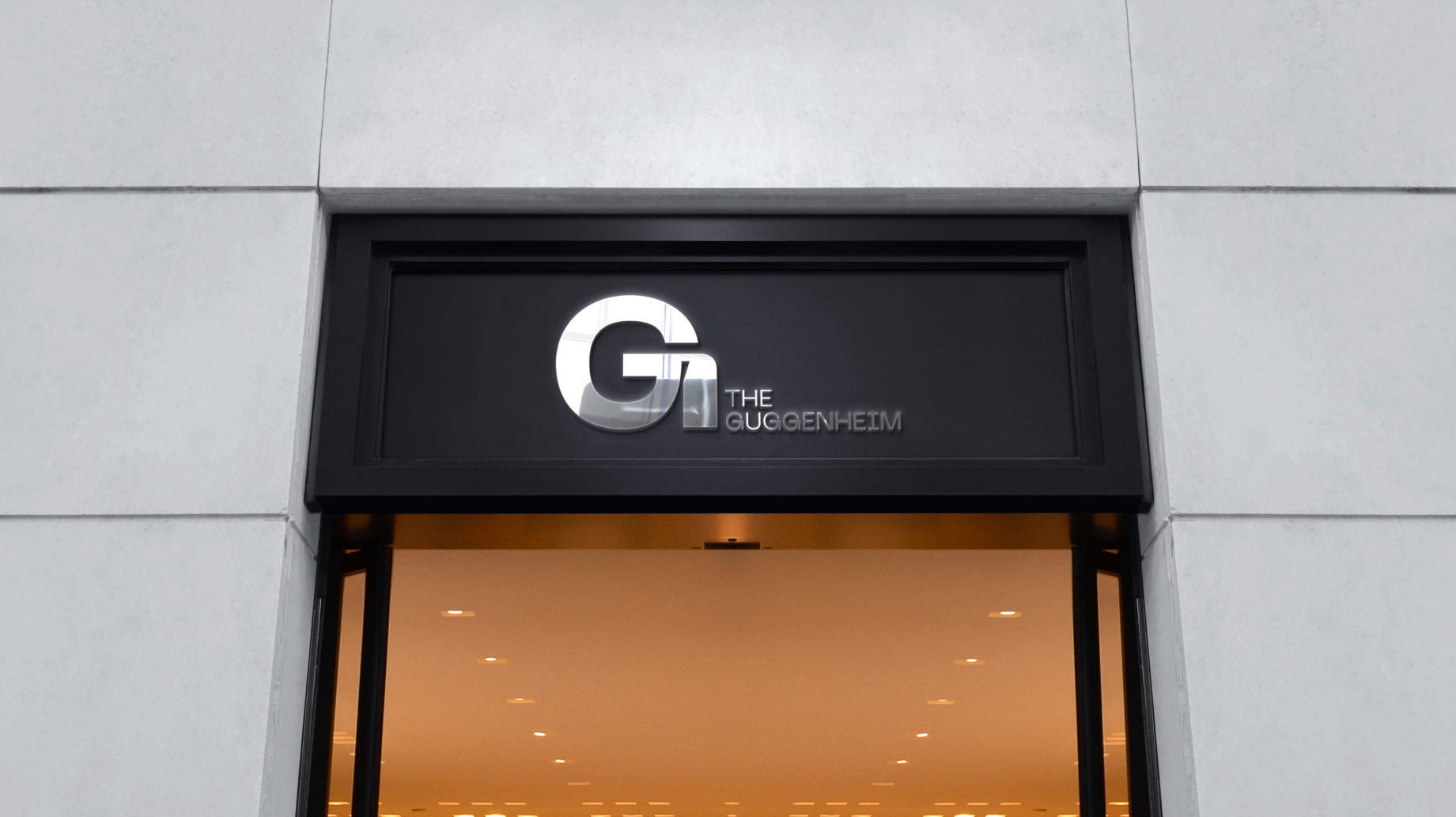
Logo
I decided to move forward with the letter “G” since it was obviously the most appealing part of the name, it can serve as a great reference to the brand and it would not suffer from scaling. I understood that the use of an icon would be redundant and excessive.
Following that decision, the next step was finding the right typeface.
After a few experiments, I decided to settle with Neue Machina. A powerful and meticulously crafted typeface boasting monospace/geometric type features as well as apparent and deep ink traps in its heavier weights.
I created a few other variations depending on various formats and concluded with the following one.

Typeface
The logo crystallized the rest of the branding process as I thought it would. I knew that following minimal, black&white elements would be the perfect match for the brand. The main typeface (Neue Machina) would communicate the brand, its simplicity and organic appearance resemble very much the identity of the Guggenheim, in combination with the font Inter for communicating actual information via text, mobile, and web channels.
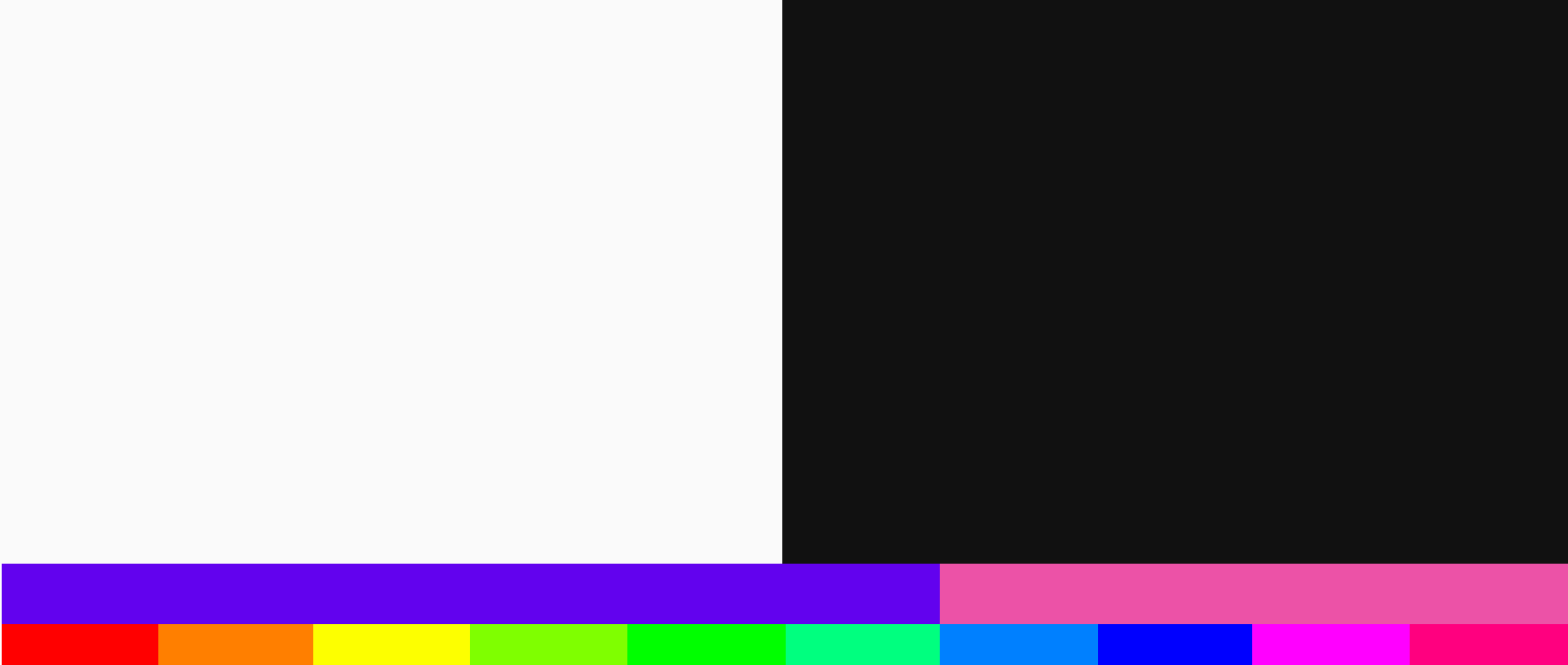
Colors
Obviously, I continued with the path that was set forth by the Logo and Typeface, adding Black and White as the main colors. To be precise, I did not use plain versions of the above mentions colors for accessibility reasons that could possibly create problems on web and mobile platforms.
For the secondary color palette, I used the full spectral colors pulled from visual elements influenced by Baugasm gradients for adding elements of attraction and highlight the brand.
Here’s a scheme of the usage proportions
Conclusion
I felt that all the above-mentioned elements enhanced the identity, and set forth the path for the rest of the design process. Equipped with these brand elements, the Guggenheim museum was ready to enter the digital space of crypto.
NFT Marketplace
Approach and Ideas
The one problem I had during this process was: how do I create a user experience that resembles the experience of entering a museum?
I started solving this problem by creating user flows, and tracking all the possible paths that a user could take during a session.
But none of the steps above seemed to really provide a solution.
Therefore, I had the idea of creating another extra step before entering the marketplace where you can interact with the art. Which is a bit different from the approach that most websites like Opensea and LooksRare practice.
For context:
When entering the usual NFT marketplace, the user is directly sent to the first and only page of the website. The only step between him (the user) and interacting with the site is the connect button which allows you to connect your wallet with the smart contract. But even that step is optional because you’re still able to view and explore the marketplace nonetheless.
I wanted to focus much more on the particular entrance of the user. So I created an extra screen before entering the actual marketplace and attired it with visual elements accordingly.
High fidelity Wireframes
First and foremost, I defined the screens that I wanted to tackle.
- The entrance page
- The marketplace page
- The item page
- The profile page
- The overlay pages i.e Signup, Connect wallet, Place a Bid, Response pages, etc.
Creating the wireframes I was able to precisely track the user flow and understand how to provide visual elements that will enhance the overall UX.
Visual elements
This part was very much influenced by the brand identity. After doing my initial research I viewed a lot of images of the actual museum and was inspired by its simple but modern approach to exhibitions.
I decided to use 2D vectors as a base for creating the layout of the screens combining geometrical and organic elements together. Also, using the digital art movement Baugasm as inspiration for creating depth and attraction to the “Digital museum”.
Also, typography played a big role in the overall layout of the website. I used bolded and big headlines to reflect the identity of contemporary art.
Components
After establishing the user flow and the visual elements that would accompany it, I started creating the first components such as primary and secondary buttons, iconography, cards, etc.
This part was especially rewarding because I was witnessing all the pieces come together.
Prototype and interactions
After creating the components and specifying the layout I started to assemble together the prototype. I started with “The Entrance” page.
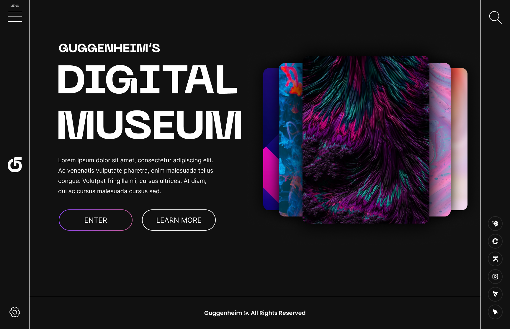
Using interaction design I figured out a way to create an experience similar to that of entering a museum which gave the user a more solemn gateway to the marketplace.
During the process, I used a simple but probably unusual grid for the layout. I used the margin as columns for interactional elements such as the menu, the search bar, settings, and social media links. The negative space became much more useful and appreciated than it usually is in web design. It helped increase the importance of every other element creating a clean visual view.
The information hierarchy became very polished and spotless because of the grid.
The next step was to tackle the actual marketplace:
I used inspiration from various existing marketplaces but tried to enhance the UI with the visual elements of the Brand.
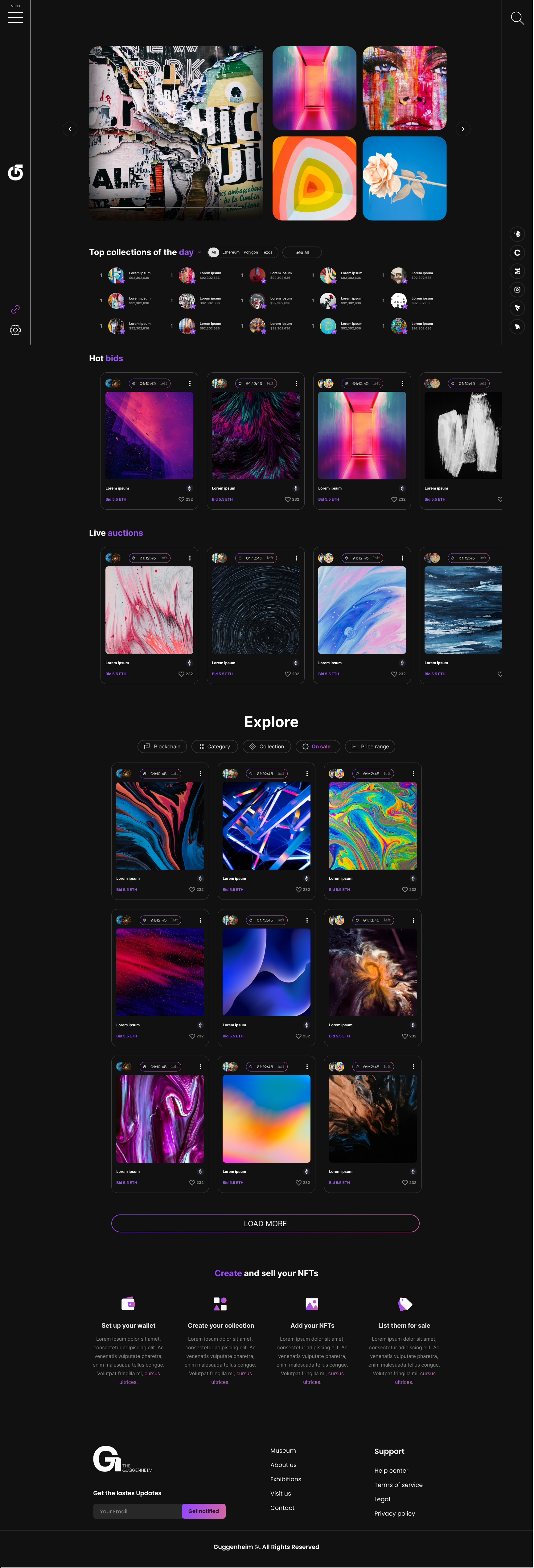
The interaction design is very much inspired by classic social media apps, where the user has the possibility to scroll horizontally, this way enlarging the limits set by the fixed columns. Regarding the information hierarchy, I decided to create a highlighted section with various banners from trending collections and use swiping motions similar to those in Instagram stories.
Second that the most importance is given to the actual creators in the next section. Furthermore, I categorized other sections by “Trending”, “Live Auctions” and a part where the user can explore themself. Before the end, I decided to include a “How to” part where users of that particular demography can, if they’re not able to, go through the initial steps of setting up their wallets and prepare to interact with the marketplace.
Conclusion
Having pointed out the initial problem that came to light when accepting the task, where The Guggenheim had to create a different experience from the usual NFT marketplaces, I consider having it solved through a bit of a different approach than normal. The extra screen in the beginning, along with the interaction design, gives a new and fresh motion to the user that resembles very much of the experience of entering a museum.
Check out the full prototype on Behance :)