A Visual Guide to Avoiding Rugpulls and FOMO Buys on Chain
🚨 This article is for you if you've ever: Ape into new tokens on pump.fun or random DEX pairs - only to buy the top Feel confused when staring at charts Want to quickly judge whether a token has real buy pressure or is just a bot loop
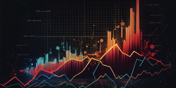
Why Should Meme Traders Bother With Charts?
You might think candlestick charts are only for technical analysts with RSI and MACD dreams. But in reality, on-chain snipers and meme coin farmers should be reading charts even more carefully.
Here's why: The first few minutes after launch are chaotic - wallet trackers lag, but charts reveal whether the token is just getting off the floor Price up, volume up = real money flowing in - helps avoid buying after the peak If it's an older token, the chart tells you whether it's bottoming out or about to make a second run
Chart Basics: Only What Actually Matters On-Chain
Forget the complicated indicators - if you're trading meme coins, here's what you really need:
-
Candlestick Shapes (Just the Essentials)
Each K-line (candle) shows: Open, Close, High, Low. Green = price went up. Red = price went down. Quick reads: Big green candles = early pump, possibly real entry point Big red candle = likely dump; don't FOMO just because one green line came after Long lower wick = someone bought the dip - potential short-term support Smoother charts = natural flow, real interest Choppy/erratic candles = often bot wash-trading
-
Volume (Your Rugpull Detector)
Volume is your best indicator for real vs. fake moves. Price up + volume up = real buyers Price up + volume flat/down = fake pump High volume at top = whales dumping
Tip: When checking a coin on Dexscreener or pump.fun, always enable the Volume panel, and scan the 1m / 5m chart to judge if buyers are entering - or exiting.
-
Trend Timeframes (Local vs Macro)
Use different timeframes depending on the token's stage: Stage Chart View What to Look For First few mins 1-minute K Is there a steady ramp or instant rug? 10+ mins 5-minute K Is a base forming? Healthy climb? 30+ mins 15-minute K Trend confirmed? Is there consistent volume inflow?
Real-World Tips for On-Chain Chart Readers
🧪 If you're scanning fresh meme coins, here's what to remember: The first 3 candles matter most. Is this a real pump or just bots buying from themselves? Avoid FOMOing after a dump + one green candle. It's often a bull trap. Check chart texture. Super "smooth" action with zero volatility can be a fake market. Real traders create noise.
Want to Build Your Own Strategy or Charting Tools? If you're a builder or want to code your own trading assistant, consider using APIs like: DBot's open API and WebSocket Track live wallet trading activity for custom alerts Analyze volume/tick data across chains Build your own "pump signal" bot
📉 Can't read charts? You're trading blind.
📊 Only read charts? You're a TA daydreamer.
🧠 Combine charts + on-chain data = Real edge.
Stop relying on random Twitter "just bought / just sold" posts. Charts won't lie to you - they reflect every decision made with real money.
If you're looking for an all-in-one K-line viewer + trading automation tool, you might find tools like DBot useful - supporting SOL/EVM chains, with ultra-low fees for pro users.