
“Nothing retains its form; new shapes from old. Nature, the great inventor, ceaselessly contrives. In all creation, be assured, there is no death - no death, but only change and innovation; what we men call birth is but a different new beginning; death is but to cease to be the same. Perhaps this may have moved to that, and that to this, yet still the sum of things remains the same.”
(Ovid)
-
1. Introduction
-
2. Backstory
-
3. When I Met Opepen
-
4. The Process: From Prototypes to Phase I
-
5. The Phase I Collection
-
6. Starting Phase II
-
7. In the meantime, mints time.
1. INTRODUCTION
Tempeporary is a long-term experiment exploring the concept of temporariness and degeneration.
The project follows a series of analog processes and is divided into two phases:
-
Phase I, “Creation”, in which I shot Polaroids with a mixed technique
-
Phase II, “Degeneration”, in which I bring the created material to ruin through a slow degenerative process. My control in Phase 2 is minimal and the end result is not conceivable.
After the degeneration, I would like to propose the final result to Opepen Community as a dynamic set. The collection consists of 80 Polaroids divided across various edition sizes (40/20/10/5/4/1).
The concept originated from a project I started in 2018, titled **“Routine Against Anxiety”**, consisting in more than 200 Polaroids, for which I created this series of chemical (and natural) experiments. I will present R.A.A. in the second half of 2025.
What you are about to read is the diary of the initial concept and Phase I.
Phase II has been underway for a few weeks now, and there are still many more to come to finish it.
But in the meantime, I like the idea of revealing the work in progress and how we got to this point.
The dilemma is always that, why write all this stuff if very few people will read it? I like talk about process and I love to keep a diary of creations. And I really like to do it on Web3, because it gives me the idea of something that stops time, immutable, opposite to the theme I am talking about here, becoming.
In a few years I will return to this page and everything will have changed, except these words, standing still.
Hope you enjoy, feel free to express your opinion, I’m ready to listen.
.

2. BACKSTORY
Notice of transparency: since I’m not very good at synthesising, I anticipate that this part is very long and descriptive, even of information that you may not be interested in, but which I think is useful to write down in order to make you understand the process I started with. Feel free to choose. So if you are in a hurry, or simply do not feel like reading too much and just want to get an idea, go to the chapter ‘The Process’ or directly to “The Collection”.Last thing: I apologise in advance for my English, I helped myself by checking through the translator, but I know it's not the best, but I hope the message gets through.
So, let’s start.
The year 2018 marked a pivotal moment in my life, accompanied by many challenges. In June 2018 I received a diagnosis of autism (in my case formerly Asperger's Syndrome).I found out I was autistic a few years earlier, around the age of 24, but that year I confirmed my certainties, changed many perspectives of my life and started to take care of myself.
It's good to find out how your mind works. You grow up thinking that all minds work the same way, instead we are extremely complex beings and the only thing we really have in common is that we are all different from each other. That's the uniqueness.
It's hard to explain how useful it is to know one's sensery functioning (both in and out) and, for example, after a series of tests to realise that I have a visual mind, which facilitated me a lot in my work as a photographer and which I now handle much better. Having more information about oneself is a turning point in managing daily life, both for strengths and weaknesses, which can be many and should not be hidden or avoided, but first of all accepted.
Back to story, in the same month (June 2018), I began a new job in recreational therapy, working closely with individuals with rare disease, disabilities and neurodivergence.
These events led to a radical shift, significantly improving my overall well-being. I found a balance in my life characterized by satisfaction, optimized energy management (to avoid sensory overload), and a close connection with diversity. This has remained my focus to this day.
Three years ago I founded, together with other neurodivergent wonderful colleagues, Unicamente, a collective that deals with various services, from diagnosis to accessibility, from a neuro-affirmative perspective.
Currently, I help other autistic adults in post-diagnosis, I became a D&I trainer and design accessible environments for companies committed to advancing “inclusion” (I don’t like the word), and continue my role as a recreational therapist through accessible photography workshops (even with visually impaired individuals—it’s all possible and wonderful).
I frequently discuss my neurodivergence as it forms the foundation of my artistic research. However, my goal is not to attract attention in a pitying manner (which I detest), but to raise awareness and demonstrate that with thoughtful environmental adjustments aligned with the Neurodiversity paradigm and the social model of disability, we can create accessible, thriving spaces for all ways of functioning. While I feel fortunate, I know many autistic individuals who struggle daily with simply living and communicating their needs.
At the same time, I am determined to talk about neurodiversity because it is still a little-discussed topic, but one that will be relevant in 5/6 years' time, in step with new academic discoveries.
There is a submerged world beneath the tip of the iceberg and the idea we have of ‘normality’ is fallacious and scientifically wrong, just look at the bummock. But it will be one of the future topics, maybe with visual artworks.
Returning to 2018, those familiar with the subject know that neurodivergence often coexists with comorbidities. For me, this included generalized anxiety disorder, perhaps the most challenging aspect to manage. To address this (and not only), I turned to photography as a self therapeutic/recreational art form.
The new job required me to travel extensively across Italy, often spending days away from home. As a routine-oriented person, this disrupted my daily life, heightening my anxiety more from the travel itself than being away. In short, my greatest stressor wasn’t staying in a different place, but transitioning from Point A to Point B. I often joke, “Once I’ve arrived, the hardest part is over; now I can enjoy myself and get to work.”
To cope, I started using Polaroids to establish a routine that expedited my readjustment upon returning home. I needed a stimulus that could accelerate this process, one that I could implement consistently whenever I returned to my city.
Routine Against Anxiety was born from this need. Another motivation was my perfectionist tendencies, which often prevented me from completing artistic projects because they never met my expectations. To counter this, I shifted from striving for perfection to embracing “perfectibility”. It’s not about meeting your highest expectations but about creating, finishing, and continually practicing to improve over time. Mistakes are essential for growth. This complete reversal of my mindset proved so effective that it led me to explore the concept of imperfection.
You don't have to be perfect, just be you.
Every time I returned home, I would grab a Polaroid camera, assign myself a theme to develop without obsessing over photographic technique, and shoot without overthinking or waiting for the perfect moment or light. At the slightest inspiration, I’d take a photo, focusing on the concept rather than aesthetics.
Once I had gathered the initial Polaroids, I began the degeneration process, which for each photo took about nine months. Here too, I had to relinquish control over the image, as my only decision was when to stop the degeneration process. The rest was dictated by time and external factors (materials used, duration, season climate).
Upon each return home, I would check on the state of degeneration. This created a delightful routine that brought curiosity and well-being. I’ve never stopped. Over time, I refined and perfected the process, transitioning from square to circular formats and producing over 300 Polaroids in nearly seven years. In 2025, I plan to select 200 of them for a collection under the aforementioned name. I currently have the last 27 in the lab, and once they’re ready (in about three/four months), I’ll begin…But first, it’s time to talk about Opepen and Tempeporary!
3. WHEN I MET OPEPEN
Two years ago, another wonderful event occurred: I discovered the works (and philosophy) of Jack Butcher and Jalil and their minimalist design principles to communicate complex ideas in a simple, visual, and easily accessible format.
Subsequently, I started collecting Opepen Editions. This collective digital museum, with its open-ended structure, inspired me immensely and encouraged further experimentation. Whenever I want to learn a new tool or design a visual workshop, I test it with Opepen shapes.
But first: if it is your first time encountering Opepen and you want to understand better, this thread by Jalil it’s perfect. Share it with friends you want to tell about the project, it has a perfect summary.
Plus, if you'd like, you can follow @opepenedition , @jalil_eth and @jackbutcher to learn more. If you are interested in it, there are a lot of great artists and collectors participating in the community and discussing or creating derivatives every day, with vivid creativity. The list is long, but it is important to follow all of them too to understand the flow. They are the beating heart of Opepen and it’s growing a lot.
My first completed project was Radiopepen*,* which I used to learn more about AI “image to image” generator tools. I published a set on Opepen.art, voted on by users. While it wasn’t widely appreciated, I value neutral critique as a learning opportunity. I the meantime I created Opepengines*,* a free collection on Zora showcasing iconic design products from the last two centuries.
Other unpublished experiments (perhaps for the future) include OpenCyanotype*,* which uses the cyanotype technique, a light-painting project inspired by Jack Butcher’s Trademark, and a children’s workshop called OpenBOTero*,* exploring body diversity inspired by painter Fernando Botero and the Bot emoticon from a previous set by JB. I won’t delve into these projects here, as they’ll be covered separately. For now, I’ll focus on the steps leading me to write this guide.
4. THE PROCESS - From Prototypes to Phase I
In October 2023, while experimenting with Polaroids, I incorporated the Opepen theme by adding a puncturing step that triggered a unique reaction during degeneration. I had tried this step before with R.A.A., but this time the result surprised me more.
The title, to be transparent, comes from a reply from J.B., in which he replied ‘Tempeporary’. Hope Initially I thought of calling it “Degenopepen”.
After nine/ten months, I halted the process and fell in love with the results, which encouraged me to pursue a dynamic set proposal for the Opepen community.

This is the first one I made, a prototype for Edition Size 40, and I have continued by making five more prototypes for the remaining Edition Sizes, which you will see in a moment.

As you can see, the image has reached an uncontrolled degeneration, very similar to fractals, with particular details if you zoom in. Here the zoom at 100% and 300%. Regarding technical information, the original files are TIFF 4163 × 5052 1200dpi.
As I shared updates on this project, following the "building in public" principle, I analyzed potential obstacles that could hinder progress, as frustration is always a risk:
-
Expensive costs of materials (Polaroid packs and degeneration supplies)
-
Duration of the process
-
Valuing what to do with the Polaroids before degeneration, working on the concept of temporality (as in R.A.A.), while adding an aesthetic that is imperfect yet linked to the design of Opepen.
I started buying materials gradually each month. Additionally, I used natural materials, some sourced from my vegetable garden. The results were satisfying—in some ways, significantly improved (design as constraints!).
The degeneration process, as shared in several posts on X, needed to be accelerated from 9 months to 3 months. While possible, this aggressive approach risked completely ruining some images, so constant monitoring, especially during the final period, became essential. I am often not at home, but when I am, I always try to check daily.
So, I took five more old discarded Polaroids and started to have fun. I defined the various shapes for each Edition Size, always using pinging as a technique. I prepared the degeneration areas and by making the step more aggressive. And wait…
I was able to stay on schedule, about 3 months.
I really liked the results, as always unexpected, it's a world to be discovered with a magnifying glass, minutes and minutes of observing the tiny details. Sometimes they also remind me of mushrooms and mycelium.
Here’s the results:

Pre-degeneration, I tried to colour some of the punctures with a metallic dye, a symbolic reference to the beauty of fracture, as is the ‘Kintsugi’ japanese technique or the emotional strength of the ‘Sarajevo Roses’. In some cases I liked them, in others not. I'm still not sure what to do for the final versions, maybe you can give me some advice. If you like, write to me!
Now, one by one the other five…

For Edition Size 20 I chose the square, a classic shape of many beautiful Opepen sets. I did not add a dye to the pierced dots, but they are interesting that they look like volcano craters seen from above.

The Edition Size 10 is a clear homage to VVR, Set 005, one of my absolute favourites. Although you can't really tell, I added some metallic (silver) dye to the stitches. The emerald green hues that emerged are wonderful seen in detail.

The Edition Size 5 is a homage to Kairos, Set 012, in which the shape of the circle and the square converge. I added a metallic dye that has been eaten away by degeneration. I really like the overall effect of the image, it looks like an area view of glaciers in the Arctic.

The Edition Size 4 takes up the shape of the circle, firstly found (I think) in the Zorapepen,Set014 by Ripe, or in DNIFTY’s Ensō ,1/1 Set 040 and in :, the Emoji Set 045 by JB. I added a metallic blue dye to the stitches, but was not satisfied with the result.

And finally, the Edition Size 1/1 with the classic Opepen shape and the check in the top left-hand corner. This is the only set of which I am not satisfied with the shape and so I decided to change it. The check detail is so small that it is in danger of not standing out from the Edition Size 40. I chose to use the shape of the Checks, the collection that predates Opepen, going back to the concept of ‘Consensus is Temporary’ and opting for a Round Frame version of Polaroid 600. From a technical point of view it will be quite hard to be precise with the stitching, we'll see what comes out. As for the overall result, the work came close to being completely destroyed. I left it in the process a few days longer than the others and some parts are completely damaged, but the effect and colours are wonderful.
I would not like to use prototypes in the collection. They are a documentation of the process, it seems useful to me to detach them from the final project. I will understand later what to do, but it is as if they were the “archetypes” of an unpredictable becoming.
About Phase I
So, prototypes worked, so what to do with polaroids before degeneration? Taking a cue from Routine Against Anxiety, I decided to shoot memories that will fade away, giving me some limitations in this case, which I will explain in more detail.
A Phase I needed to be created, so I started thinking about films. To further differentiate, I decided to use a different version of Polaroid 600 Film for each Edition Size. Some harder to find, others newly released editions to try out.
And, last but not least, the choice to use the particular Round Frame film for the 1/1 edition and use the Checks shape. I will discuss this choice further in the future Phase II guide.

Regarding cameras, I used four different Polaroids, all from the 600 series. In this case it was more for fun than for necessity, as the results do not change much.
Here is a list of the ones I used:
-
Polaroid One Step
-
Polaroid Spirit 600
-
Polaroid Supercolor 645 CL
-
Polaroid Pronto600
-
Polaroid 636 CloseUp
Then i designed a simple style and method that embraced imperfection and an Opepen-based aesthetic.
This phase had to integrate into the initial process without requiring post-production (a strict rule). Thankfully, alternative techniques for Polaroids from the 1980s proved incredibly helpful. I created some hand-drawn mask with the deliberate intent to deviate from perfect forms, sometimes intentionally “causing” myself discomfort.
Scratches, masks, bits of tape, those imperfect symmetries, narrowly missed. I almost always shot with one hand, without holding the camera with the other, sometimes taking videos in the process, I report some of them below. Destroy precision -> live with error -> admire imperfection, with simple tasks and limits. Obviously no tripod was used and some images are beautifully blurred.
I think I have told you enough and hope I have not bored you!
Below you will find the Phase I full set, with descriptions for each Edition Set.
5. THE PHASE I COLLECTION
Edition size 40 - Imperfection Training
Edition Size 40 is divided into 6 different mini-sets, each with its own identity, rules, and precise tasks that I self-imposed. The entire Ed 40 follows the classic Opepen shape, all hand-drawn—some rougher and more damaged, others more precise and refined. The main theme, as the title suggests, is a continuous exercise in imperfection. Once the rules and limits are set, the rest becomes a game of intuition without overthinking. Initially uncomfortable, over time it becomes extremely relaxing and comforting, which is the very strength of suspending judgment. I used a total of 6 packs of Polaroid 600 films, for 48 shots in total, of which 8 were discarded and used for testing Phase 2.

Miniset 1 - Set the Timer
One hour of time in which I set 7 alarms (8 actually, but one is discarded). When the alarms go off, I must photograph whatever is in front of me and inspires me at first glance, as usual without overthinking. The Opepen shape was hand-drawn with a blue marker, very roughly, with outlines retraced and then crumpled and scratched. Polaroids were taken in July.


Miniset 2 - Red Vibes without Stripes
I chose to shoot in the Chinatown neighborhood of my city. No alarms, but a maximum of 23 minutes to complete them. The color red defines this mini-set, with the Opepen shape hand-drawn and filled with polka dots, also in red. Polaroids were taken at the end of July.


Miniset 3 - August Banquet
A barbecue with friends in the mountains on August 15. No particular restrictions—photos taken between meals and glasses of wine, very chill.The Opepen shape is classic black, in homage to Set 10.


Miniset 4 - Y.E.L.L.O.W. You Empower Life, Love, Opportunity, Wonder
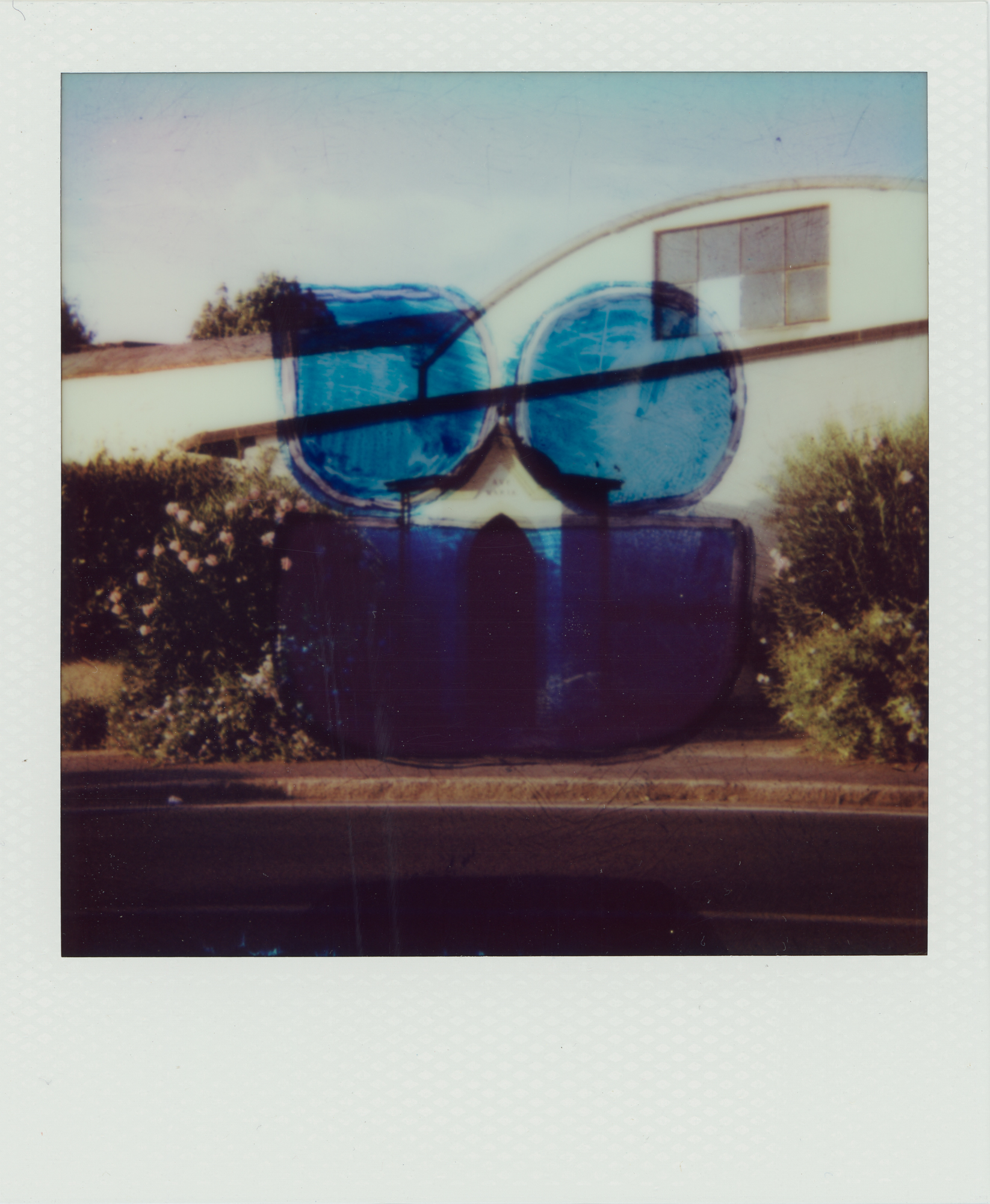
A conversation with F., a dear friend returning from Japan, and a walk along the river during the golden hour, when the sunlight begins to lower. Without setting goals, just walking wherever our thoughts took us, we had a wonderful encounter: a mutual friend with whom we once traveled to Sarajevo, now back in town with a new addition—his child. Both were immortalized, with the baby’s eyes covered by sunglasses for privacy. This was undoubtedly the most emotional mini-set for me—so spontaneous, so human.The Opepen shape is yellow with black outlines.


Miniset 5 - G.R.E.E.N. Grow, Renew, Energize, Elevate,Nurture
Created immediately after YELLOW, along the other side of the riverbank, which was more natural and filled with greenery. Meanwhile, F. told me more about Japanese culture and we talked about the differences with our country—so distinct, yet occasionally so similar. The Opepen shape is green with black outlines.


Miniset 6 - Define your Shape
Early September. A project focused on exploring contrasts, with the Opepen mask in negative: empty inside, colored outside in blue, opposite to Miniset 1. I chose mirrors, nature, religious elements, household items, and light plays as subjects. All elements that, at first glance, immediately evoked the concept of contrast, no time to think.


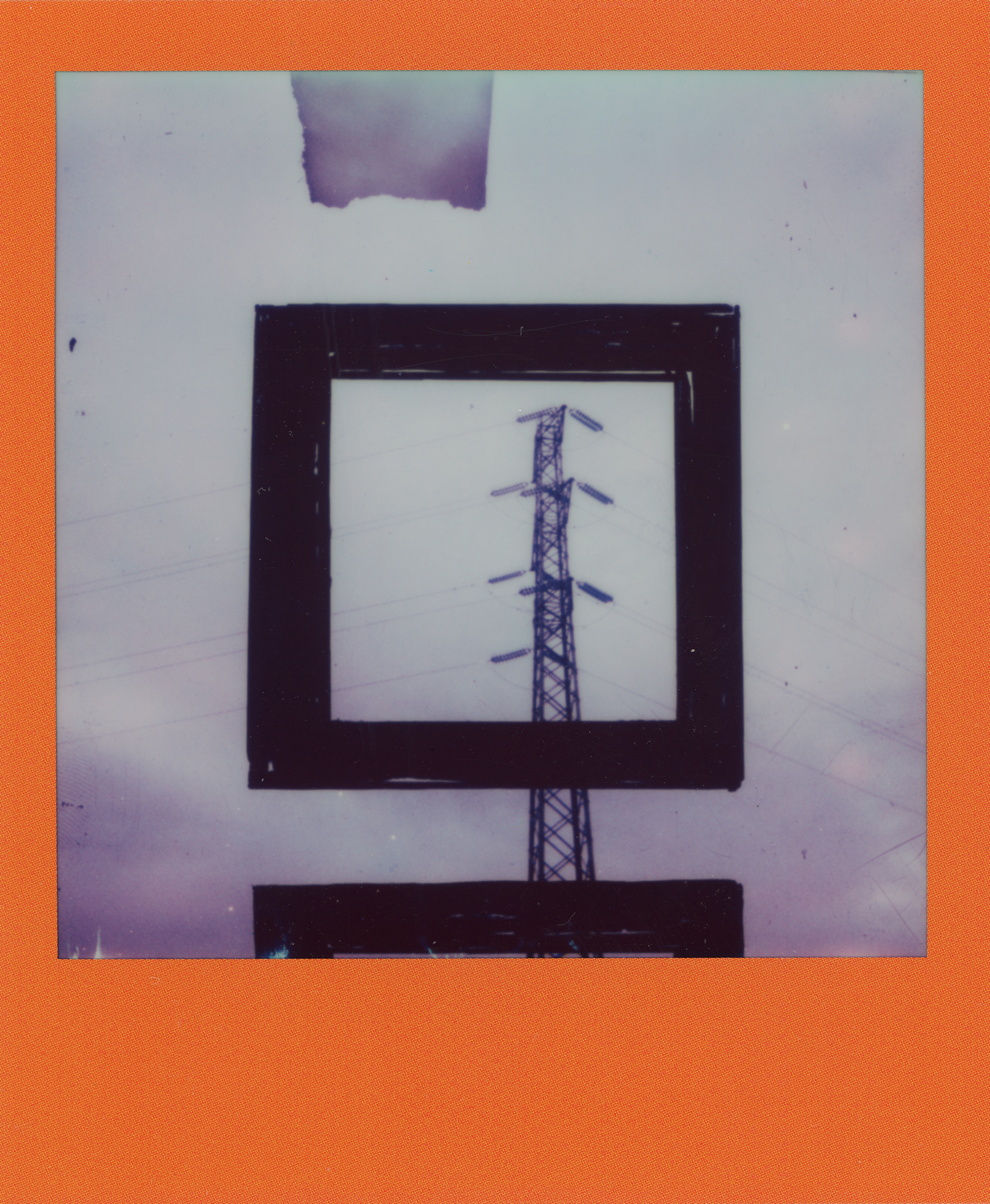
Technicolor - Edition Size 20
For the Edition Size 20, I chose a square and used 3 packs of Polaroid Color Frame 600. Regarding the shape, there are four different types of squares: one with black edges and a blue (wave-like) interior; a square with wide black borders (only on three sides); the most common one in this series—a square with a crooked right side that almost becomes a trapezoid, emphasizing the theme of imperfection. And a blurred bichromatic square with negative mask. The images depict urban regeneration with point of connections, places that represent mobility or primarily repurposed industrial archaeology spaces transformed into colorful collective meeting points. In some images, this is clear, while in others, they are details of repurposed former factories, both in their use and aesthetic.


Edition Size 10 - Urban Shades of Grey
As mentioned earlier, the form of issue number 10 is a homage to set 005 and unlike the previous set which focused on regeneration, set 10 investigates urban decay, explores the boundaries of two industrial cities and their willingness to resist in the face of change. From monuments to decaying factories, from subways to underground garages, from mirrored buildings to urban street art. And empty billboards. I used two packs of Polaroid B&W 600s. The black and white, symbol of immutability over time, contrasts with the urban transformation of the images.


Edition Size 5 - Contempeporary
Contemporary is a wish. I chose the Luigi Pecci Contemporary Art Museum as the subject, the first museum I met in my life and a place where I hope to see an Opepen exhibition, along with many other museums of course. It is also a hope for the regeneration of the Italian museum network, it would be a good sign for the future!
But I feel it will happen.
To be contemporary, it must be something “in line with the present”. A maximum, simplified synthesis of the Zeitgeist. One day we will understand how Opepen is representing our times.
All photos were taken outdoors, they are meant to be a distant, detached observation; in this case I used a limited series of Polaroid Green Edition 600. The shape is a tribute to Set 012, Kairos by JB.


Edition Size 4 - Cloud Threads
I had a lot of fun with this project, but it was hard to get started! As soon as the package arrived I was ready to shoot, but I needed the clouds and for a week they weren't there, until they finally showed up :)
Cloud Threads is a tribute to the strength and bottom-up drive of the Opepen community. It looks upwards, towards the clouds, and has added simple stitching to symbolise the nodes of the network. The shape celebrates the strength of circularity (of opinions, of exchanges, of life) and pays homage to different sets. I used a rare set of Polaroid 600 Bichrome.


Edition Size 1/1 - Together We Success
A truly beautiful moment in my work. Hands united as a symbol of triumph over a defeated hardship. For the Edition 1/1, I didn’t impose a deadline on myself—I always kept my camera ready, waiting for the right moment, not visual but emotional/relational, to capture the shot. It happened in a city in Northern Italy at the conclusion of a recreational therapy program for young people in post-oncology hospitalization. The hands of the youth and some volunteers who shared smiles and fun for a few days. Because it’s scientifically proven that joy and well-being can help fight the worst illnesses the body can face. To differentiate and give even more importance to the gesture, I chose Polaroid Round Frame 600 and selected the Check as the symbol.
What better validation than to have overcome a difficulty? Together, we success.

This is all I could tell you about Phase I.
I don't know what I'm going to do with it yet, the first idea I had, in case the community likes the proposed set (I mean the final result after Phase II), is to do an airdrop after the reveal so that every collector has both versions, before and after the degeneration. I don't know if it can be done, but there is time to think about it. Have your say if you like.
Now it’s time for some Phase II previews.
6. STARTING PHASE II
Phase two started in November 2024.
Here I tell you what I prepared before the degeneration and where I got to.
Once the 80 polaroids were chosen, I proceeded by recreating sketches for the stitching and trying to make sense of the stitches. I will not reveal all the details at the moment, but I also differentiated within each Edition Size. I tried to be slightly more precise with the shapes and in the distance between the stitches, trying to create a contrast between brutalism and harmony. The second video is a little spoiler…
In order to be able to keep track of which Polaroid it was, I renamed each individual photo so that I could recognise it once it had degenerated.

Well, I think I've told you a bit of everything. This is the current state, I will be back with a Phase II diary in a few months. The rest is to be decided. As is whether it will become a set. I don't know what will happen, I don't know the final results of the degeneration, I don't know if I'll like it, but it has become a wonderful new routine in an ever-changing space.
7. IN THE MEANTIME, MINTS TIME.
While we wait to see the results, I will continue to update you on Phase II and will further share images taken during Phase I.
About coming days, I have prepared 3 mints for the next s on Rodeo. I will do them as soon as I finish the previous collection (the last 5 are missing), some preliminary sketches about my new PhoBIAS collection.
These are the first two, the full set in Opepen style, positive and negative version, to symbolise degeneration and to pay homage to JB's “Latent” project. For the third I am keeping it a secret.
Right now, if you liked this diary/guide I wrote, you can mint it! I like Mirror.xyz for this too!


If you have come this far, I thank you for taking the time spent to read about Tempeporary. For any information, you can write to me in DM on X. Sometimes I can’t answer right away, but I always reply.
X: @Hans__AI
Farcaster: @hansai
Rodeo: @mirkolis
You can find other collections on my LinkTree:
On my Mirror profile you will find more guides, if you feel like it there is something ready for you to read.
I greet you with my motto:
Compass Beats Map!
Mirko
