
1. Kit Valo (8bit.kit)
I stumbled across Kit Valo somewhere on OBJKT - I don’t really recall how. I don’t know them personally and haven’t seen them in any network we share. Sometimes you just see something and it strikes you in such a way that you think, “I have to see more.” I’ve tried to figure out what Kit Valo is about. If you go back long enough in an artist’s instagram feed you can start to see the likes dwindle off into obscurity alongside their earliest graspings at a style. Well, if they’ve sort of developed on insta like I did and apparently Kit Valo did you can. The earliest posts I found were still from 2021 though, so we’re not talking ancient archaeology.
Kit has a few running themes you can pick up on: a MASK the recurs -
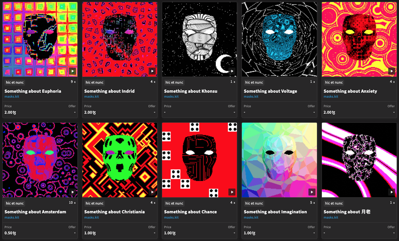
-- there’s generative/iterative elements in the art, wild neon palettes, occasional retro computing elements, and rough-edged pixellated things. Honestly, some of the same things I would use to describe my own art - so I sensed a kindred spirit. Some of these compositions even look like ones I would make with triangles and circles and so on. Generally speaking, I’d say scrolling through their 2021 art was occasionally brilliant and rarely bad.
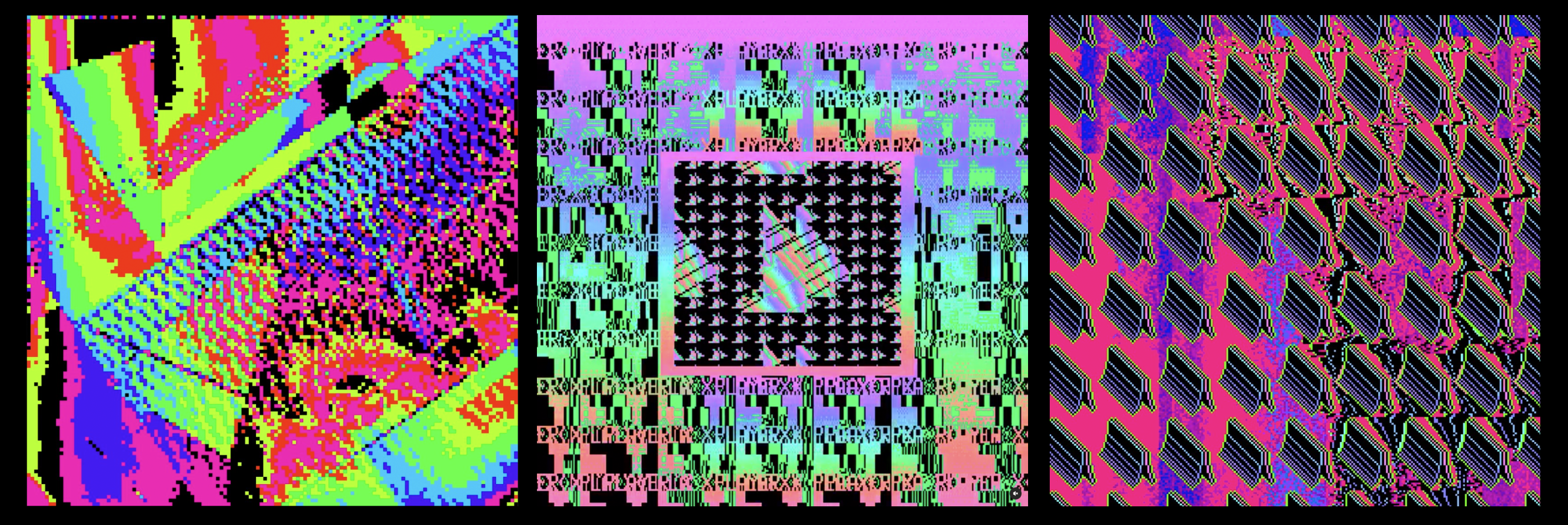
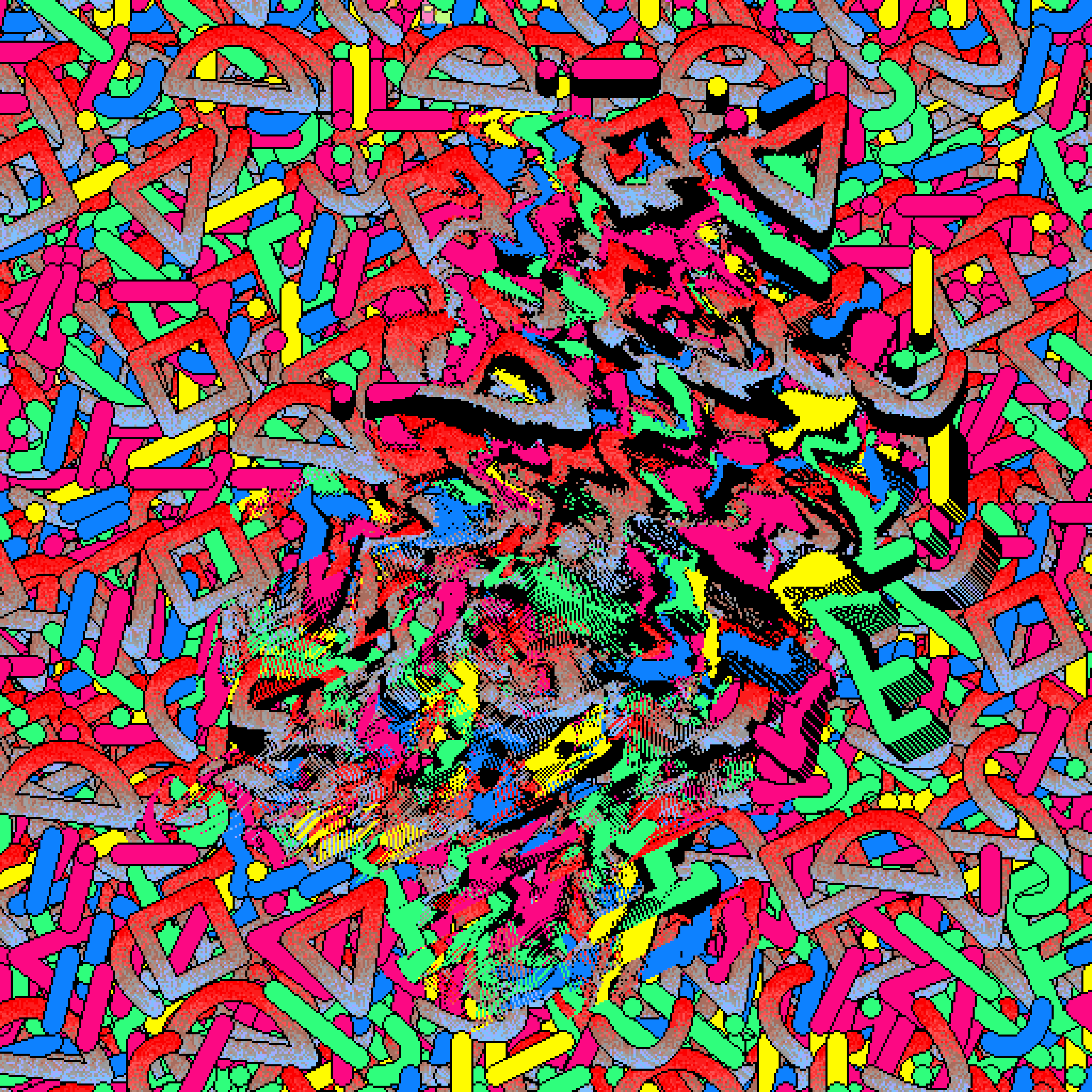
Around May of 2022 you can see a slight change of direction. One thing I’ve noticed in surveying all the wild art of the new web is that there’s a palpable difference between a randomly chosen spectrum palette and a slightly adjusted custom one. Consider these three works from early to later (roughly) side by side, and notice how the first one is a rainbow and definitely the other two are as well, but slight changes to the palette and sequence make the second two much more interesting:
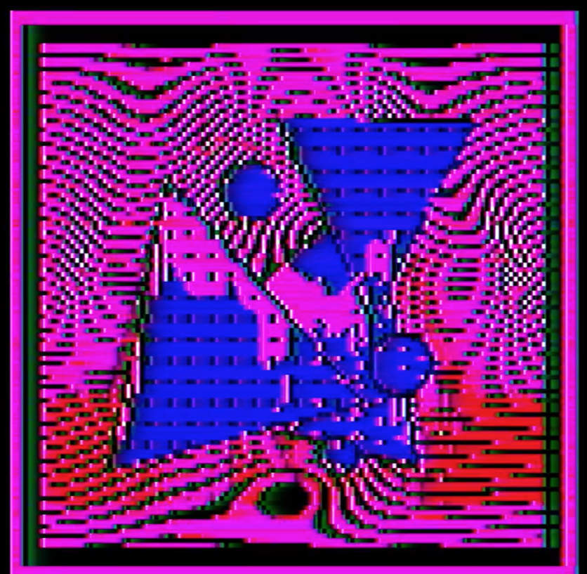
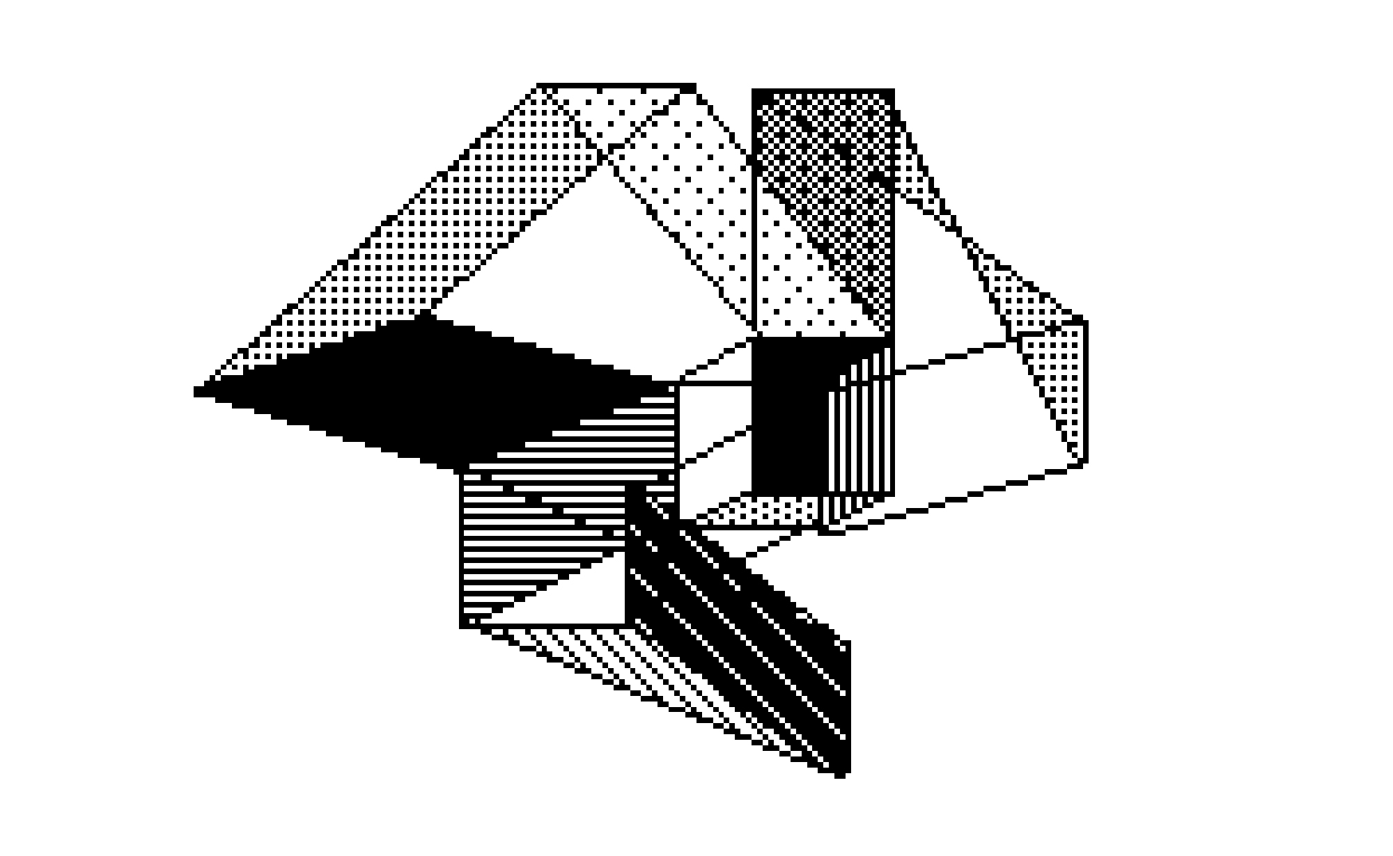
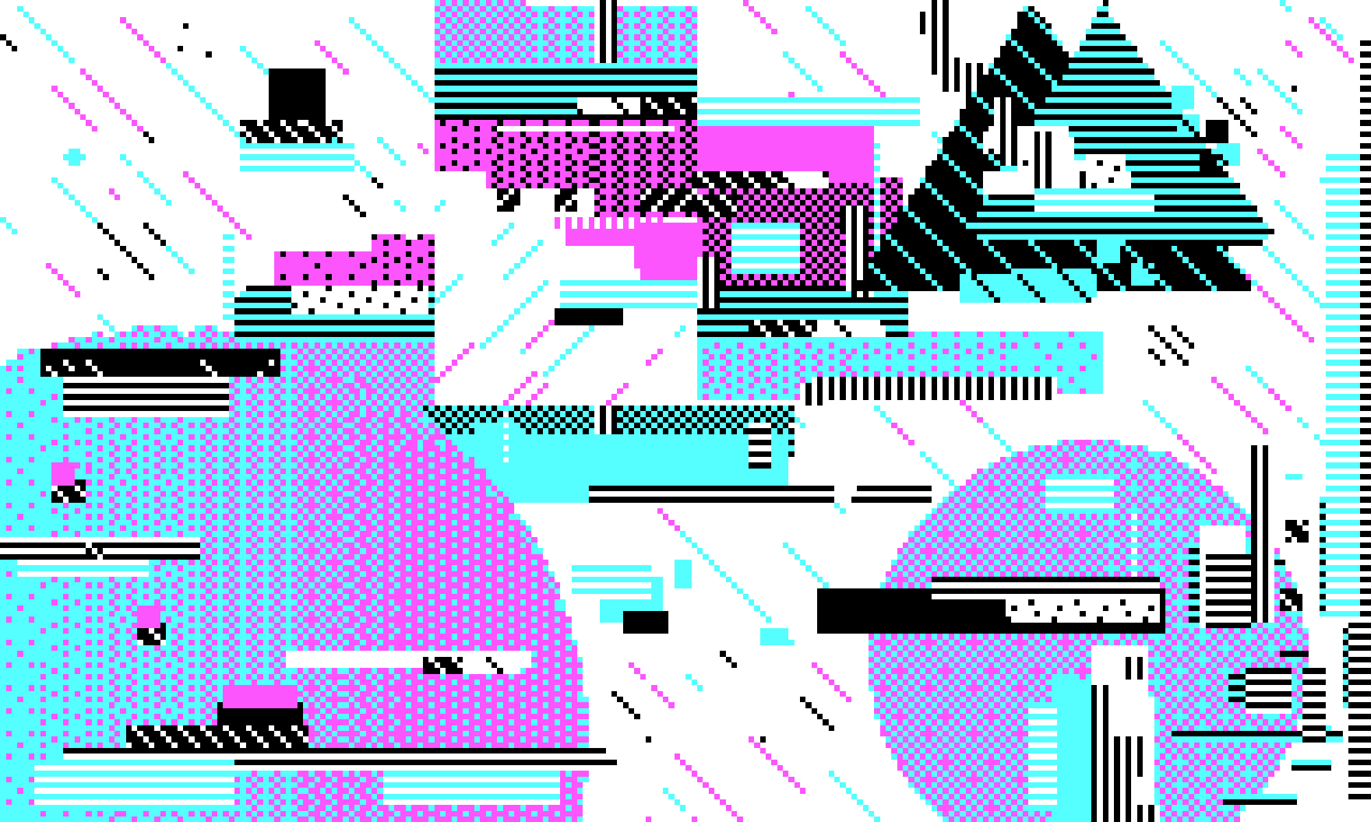
I have no idea what Kit’s process is like - looking through their work archived and for sale you can see stuff using ROM glitches like I’ve used, stuff using generative elements, and some that I can only guess is using retro paint style programs. Kit also goes back and forth between full canvas pattern work like the above (on the right) and more deliberate and occasionally simple compositions. Consider these two brilliant but very different works from August 22:
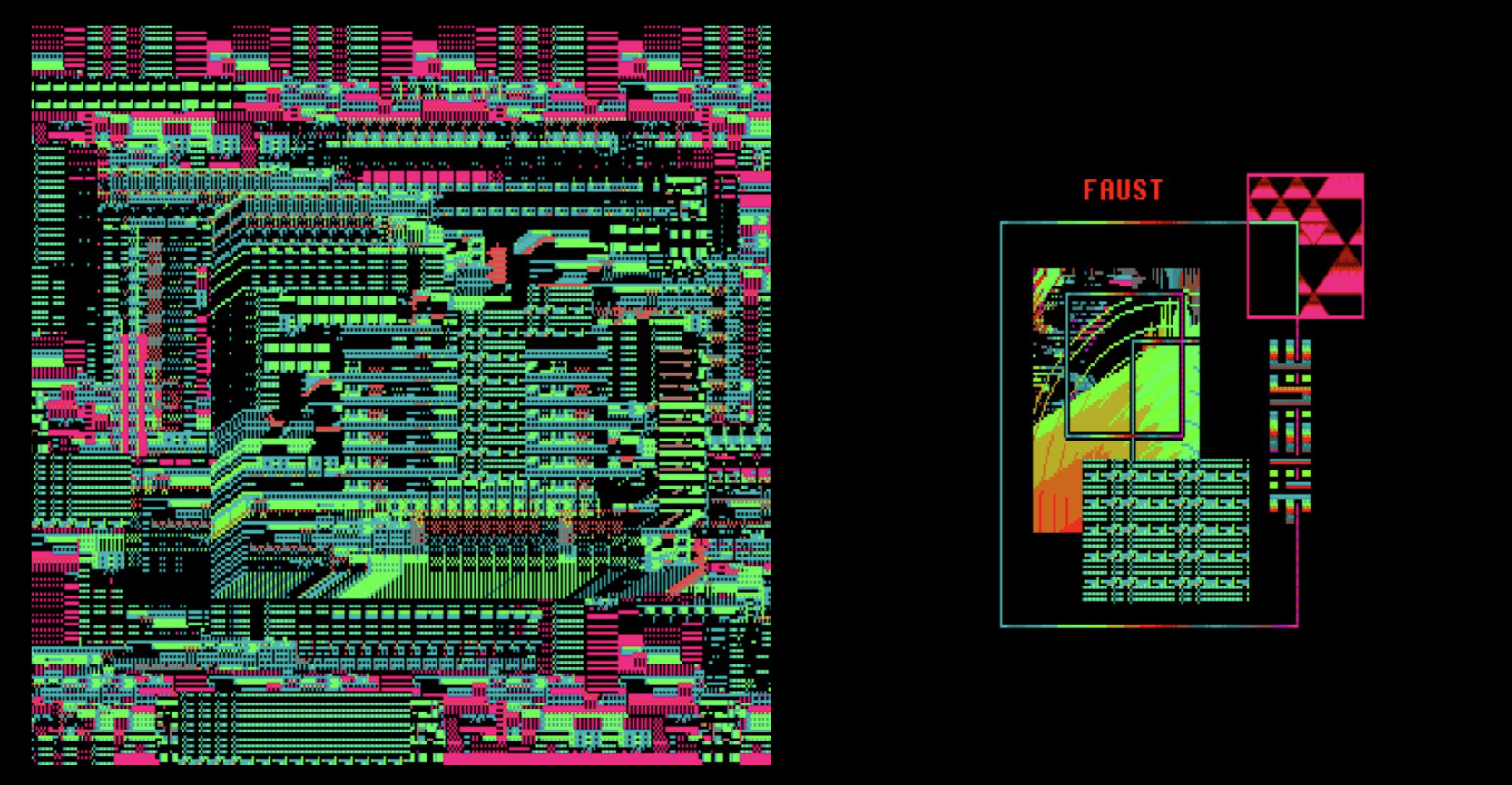
I love and use similar mechanical/circuitboard textures in my own work sometimes, and the simple yet just complex enough composition with FAUST text is brilliant. Kit’s output is pretty impressive, and the quality and variety of the work should impress anyone. There’s a challenge here - and that’s to define what it is that makes this disparate body of work feel cohesive (and it does).
Almost all of Kit’s work feels like contemporary accomplishments in a heightened retro style. That is - things that would have taken ages on old computers (but was possible) Kit Valo wields with the energy and ease and sense of exploration that is only possible with newer gear. It feels like the sturdy detail-rich designs of a chunky period more than a decade or two ago with all the sensibilities of what a person exploring digital native art today would hope was made back then. Kit sells a lot of work for incredibly affordable prices on OBJKT.com - and anyone who takes the time to subscribe and buy a few will keep coming back over and over, keep being surprised by what Kit comes up with on a weekly basis.
2. Bitebybit
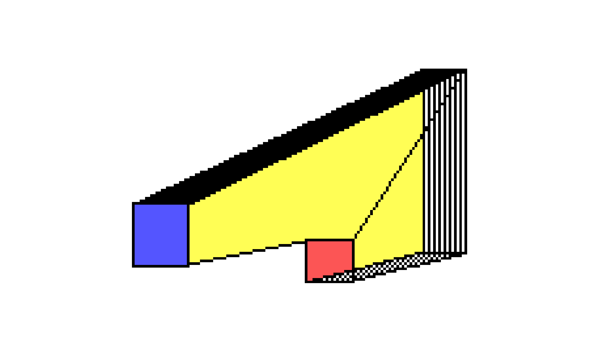
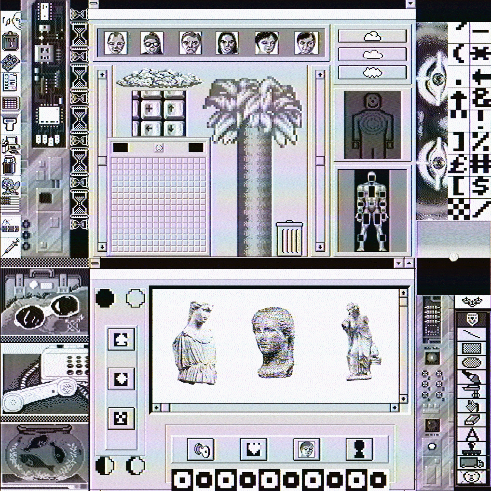
If Kit Valo earned my admiration for their complex and crazy-colored work - Bitebybit’s simple blocky basic-colored minimalist designs are a complete contrast that shows how this same retro computing style can be used in a very different way to achieve a totally new effect.
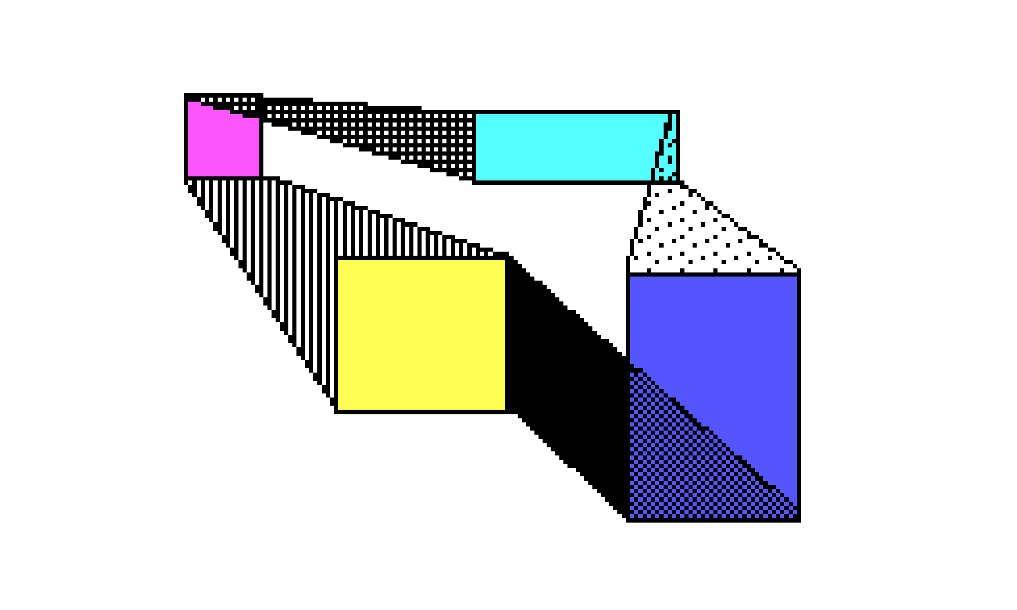
You can explore a lot of different kinds of things from bitebybit, including some animated versions of stuff built with the 1988 Fantavision program. This is all very subjective here - but my absolute favorite works of theirs are the simple but perfect little compositions made with pc paint 3.1 . There’s some on Solana too - I don’t really shop there but some of these are just as genius as their Tezos offerings. It’s interesting that some artists are really forthcoming about what programs they use and some are embarrassed or try to keep it a trade secret or something. Bitebybit is pretty transparent, which I think is a display of confidence. Some of the earlier work really pushes the format and makes contemporary looking designs (again, kind of like Kit Valo):
These are fantastic, and I hope to see more of that kind of thing from them, but at the same time what drew me and what I hope to collect more of is the simplest designs - to share a few:
My only worry is whether Bitebybit realizes just how powerful these simple designs are, and how much people like me will be here to just consume and delight in near-endless variations of the simple designs. It’s something that seems narrow in format but actually has incredibly deep possibilities built into it. The fact that it’s actually being done on really old software means that we’re not bored of seeing anyone else use those tools to exhaustion yet. Keep your eyes on them, and maybe tuck a way some of these brilliant statements before the broader market sees them for what they are. Or maybe the broader market will never figure it out and you’ll just own these gorgeous arrangements and have a richer life for it.
3. SV3ZR
While working on Inaccessible Worlds and Inaccessible Worlds: Lost Levels - I explored some of the art I ran across that was similar to what I was trying to make. SV3ZR has some really interesting work that I tried to imagine the process behind. By their own account: “…various old software are emulated to create artwork, each fragment of the composition is relocated in contemporary software so that the final work has a square shape.”
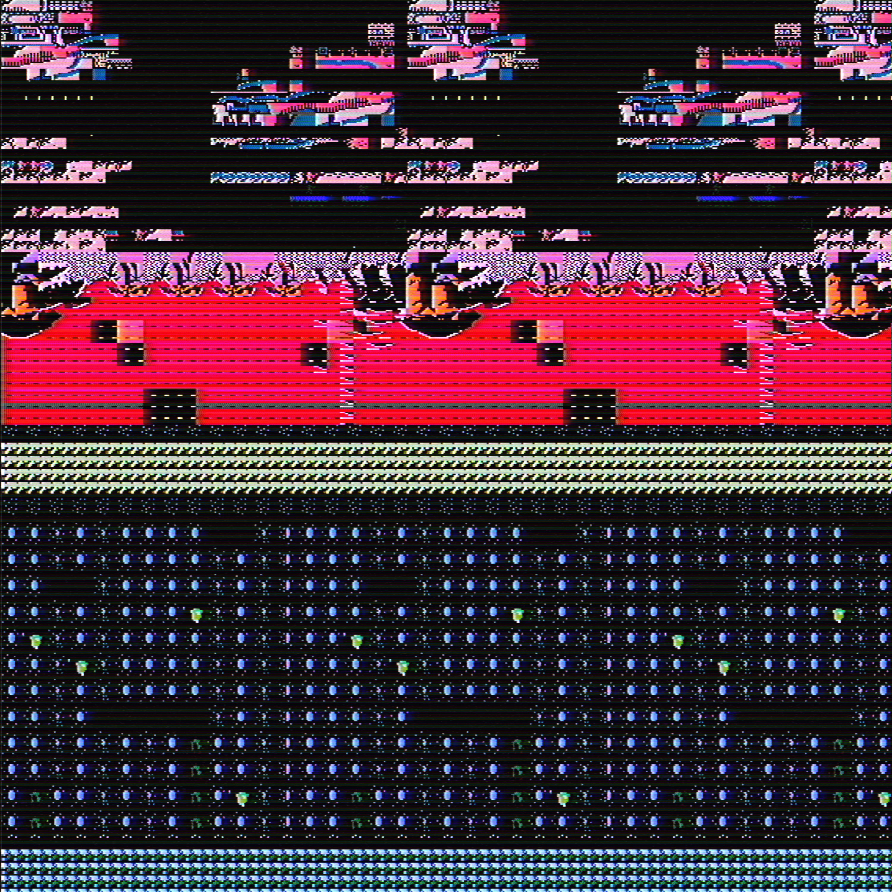
This is really familiar to me, since I.W. is essentially cherrypicking the best glitches of old NES games and combining them to make hyper-interesting versions. SV3ZR has taken cool failures of multiple pieces of software and made square compositions out of them. Exploring the details of these is pretty satisfying, and my personal favorite thing to collect from them. They are apparently using analog sources somewhere in the process too - so you get these delicious screen artifacts to go with the software crashing ones.
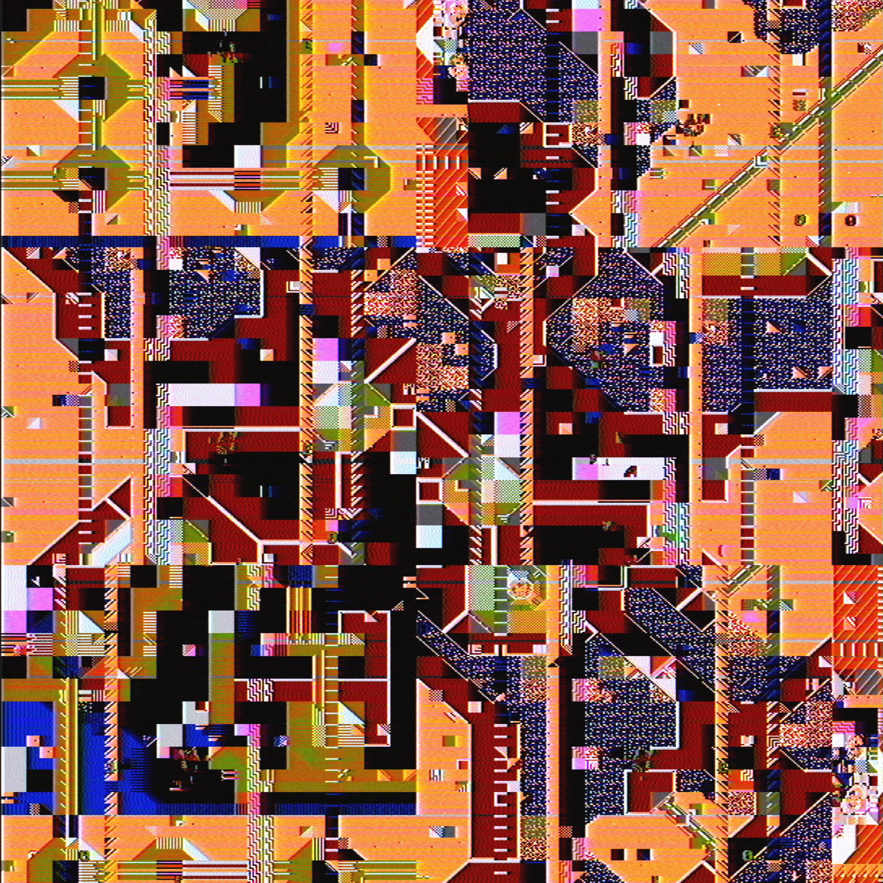
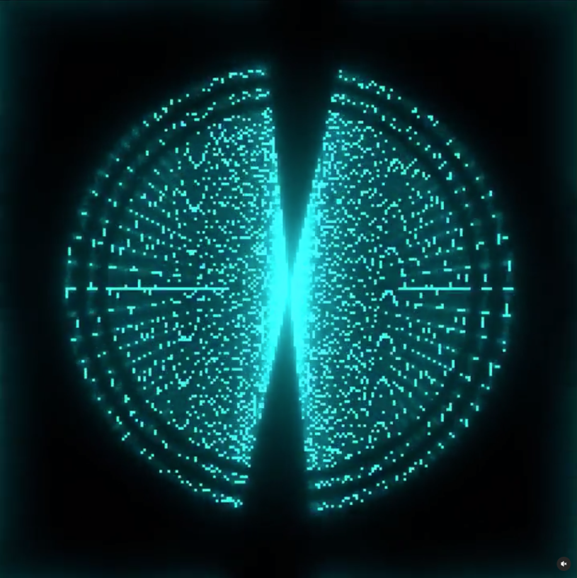
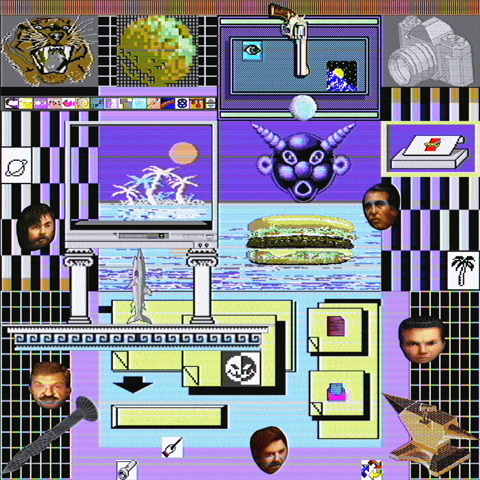
SV3ZR also has some absolutely definitive everything-in-one-place animated kind of compositions (I don’t know what people are calling this style yet) that I’ve seen in different markets. I’m just making this up, but the new window after window space next to space style compositions feel like a mature internet development. People used to spending big portions of their day looking at a dozen different windows at once find it only natural to have art that does the same rather than present one actual view of a scene. Our daily experience is fragmented and windowed a lot of the time, so to have a dozen different little expressions of art in one piece is just taking that familiarity and dressing it nicely. I don’t personally pick up a lot of these, but it’s obvious that this sort of composition is really striking a nerve right now.
Definitely dig deep into SV3ZR’s back catalogue to see a wide variety of stuff - but like Kit Valo, a surprising consistency in quality despite the different styles.
If there was a consistent theme for this episode of art picks - it’s showing how diverse the world of retro-computing as an aesthetic can be. Even when you’re looking at artists that are heavily biased towards Tezos and all working with computer software or artifacts from about a 10-year period, there’s patterned or arranged compositions, wild colors or primary simple colors, minimalist designs and maximalist windowed realities - all of it leaping back and forth between early computing and the boring tired endless internet we see now. Is it just nostalgia that makes these old aesthetics interesting? I don’t think so.
Without just waxing poetic forever: I think it’s a little like asking a modern accomplished musician to make a good 1960’s protest ballad. The tropes, the techniques, even the substance has all been catalogued and analyzed by so many people that to make a retro protest song today - a good one even - could be made by a musician who was determined. I think this is what we’re starting to see with retro computing graphics: modern techniques and available material is reaching the point where a good artist can make great designs using those old styles. It’s like an artist from back then tripped and stumbled across all the enduring and emblematic elements that stood the test of time and became the signatures of the mood. A contemporary artist has the advantage of hindsight and can exploit it to make incredible retro designs that only the rarest of visionaries could have accidentally made back then.