
1. Bay Fragile
I stumbled across Bay Fragile in the course of taking an interest in every person involved with Dos Punks DAO. If you’ve not really paid any attention - it’s mostly just a collective of friendly sincere artists taking votes on what new artist to the scene they want to support each month and then talking about that and whatever else is going on artistically in Tezos and Ethereum markets every Friday.
One artist from that collective that I hadn’t previously explored much before was Bay Fragile - an artist making glitch/ascii/dithered flavored art among other things. A very tempting rut to get into as an unofficial critic is to start just looking for artists who do what you would do, only different. It’s kind of silly, like a person who likes their own reflection so much that they trick themselves into thinking they like other people when they just like their own vague resemblance. Bay Fragile does some work that looks like things I’ve done and like, and I’m going to try to not just like my own reflection in what I see here that’s beautiful.
I think it’s a lot easier to immediately appreciate artists who have collections organized at least somewhat well somewhere. It can be tricky to control when marketplaces auto-populate, but say you’re like me and you’ve seen something by an artist and you think “Okay, clearly they have some talent - what else have they done?” Something like this or a linktree is just so helpful:
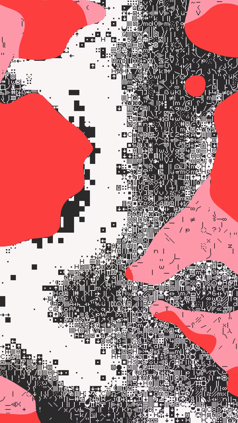
Now you can take the time to process something. It strikes me that what Bay Fragile does very well is take what could otherwise be just kind of aimless blotchy expressionism, and dial the knob back just far enough that it’s expressive and has the kind of details your eye wants to wander over rather than being a either a wash of noise or a slippery series of nothing gradients (the glitch art scylla and charybdis). Consider some very simple designs in my beloved red black and white:
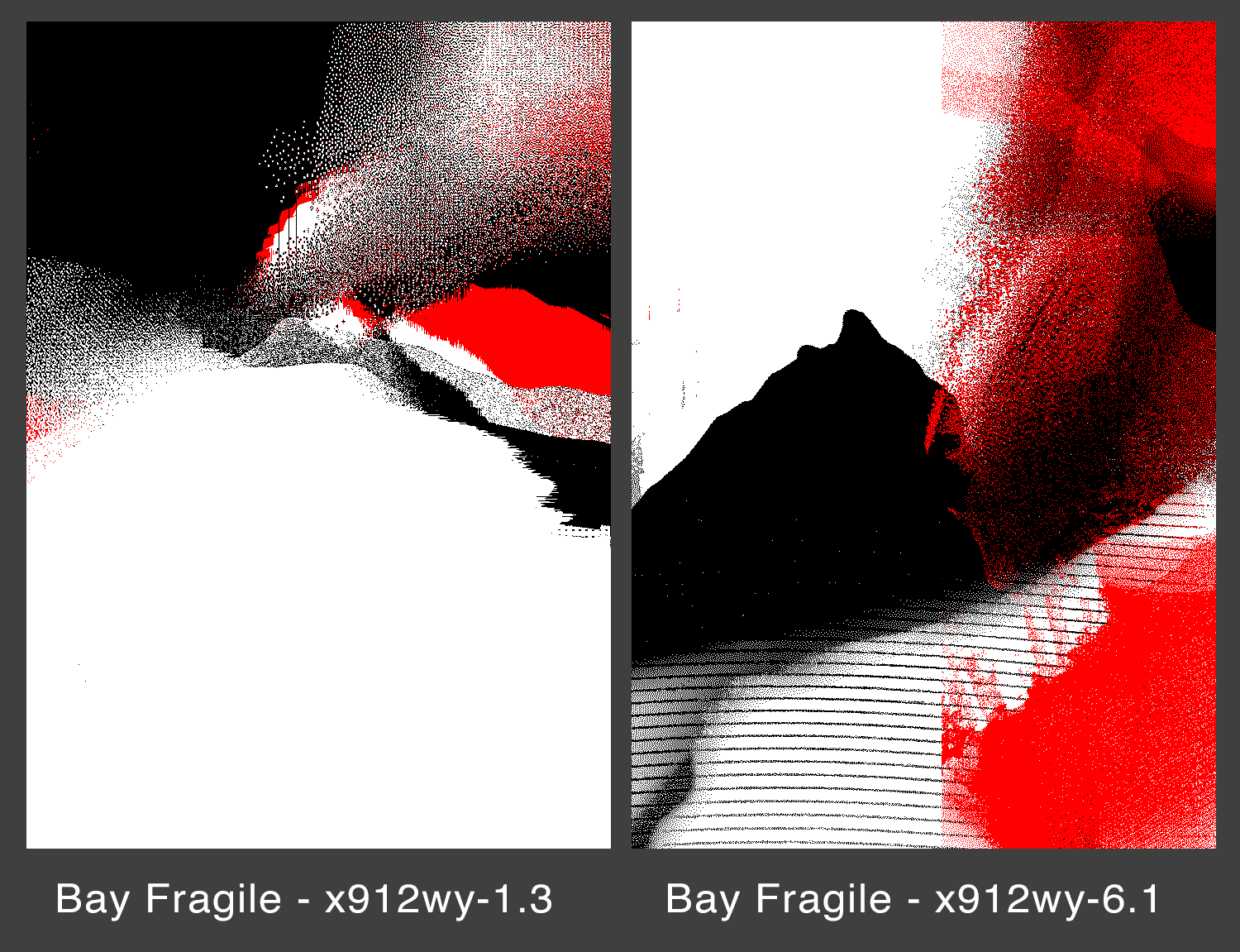
These pair as well as any meticulously selected expressionist painting from the last several decades in my estimation. The precise amount of detail we want, the amount of composition with broad swathes of shape that doesn’t disintegrate into just boring or nauseating constant movement.
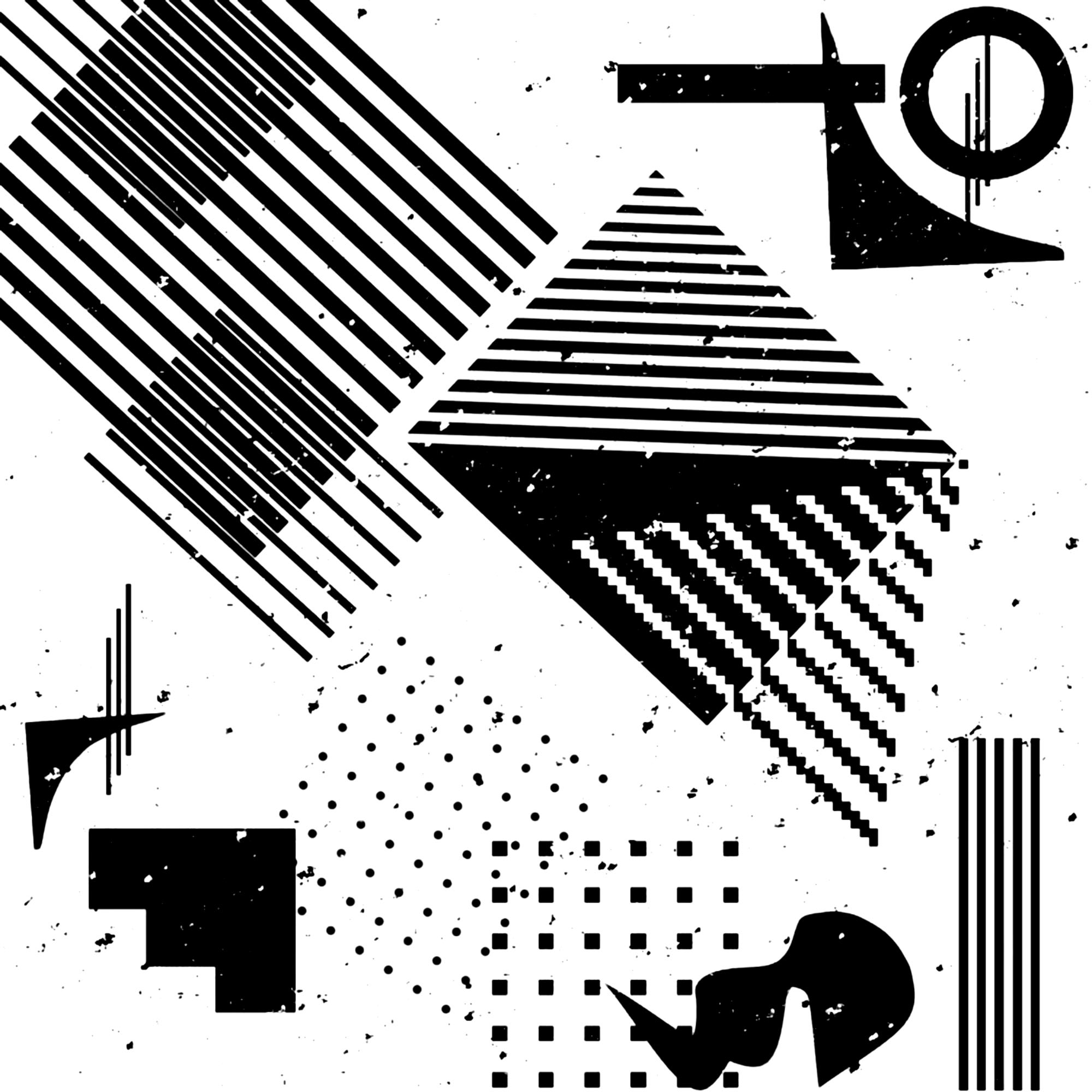
This is just one style, but Bay Fragile has also adopted using the familiar (or at least, I assume that’s the tool) Playscii for making ascii-filtered compositions. That tool’s creator has come out very anti-NFT (despite Max Capacity’s best efforts) and I think it’s a shame because most of the reasons that programmer didn’t like NFTs have become moot or are disproven by the decidedly non-scam efforts of sincere artists. At any rate, the results speak for themselves because an artist that pays close attention to how the details are rendered through this technique can make incredibly cool stuff that feels fresh even though it’s mimicking a technology that’s obsolete.
Here’s just three pieces set side-by-side to show how solid the color selection is:
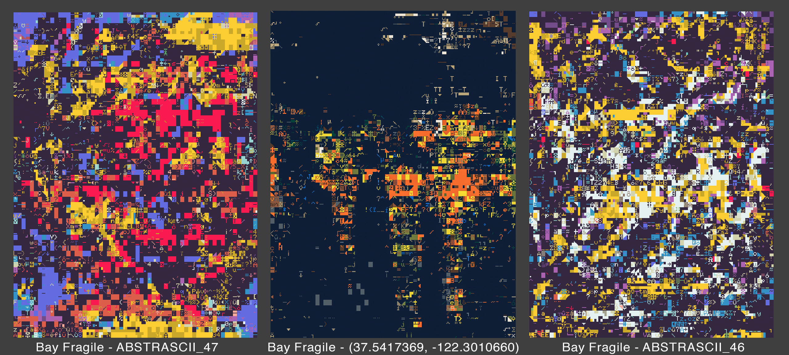
My advice: take the time to let your eyes pass over it maybe 1/6th at a time. Notice how satisfying this stuff can be if you accept it as something like a new ascii-flavored Rothko:
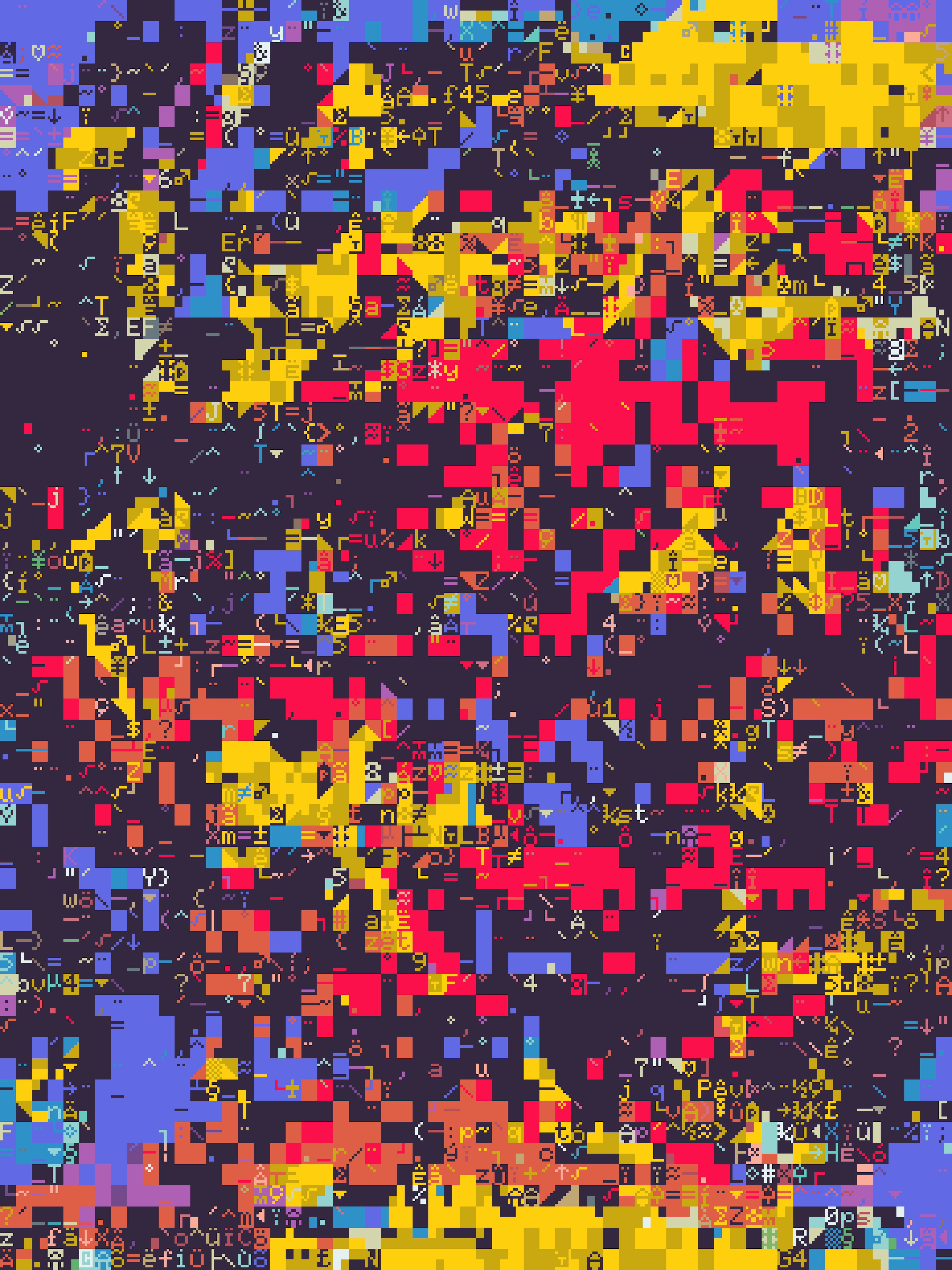
I’m not just dropping Rothko’s name to be provocative - it’s a very real and normal and natural response when someone asks what makes a Rothko any different or better than any other series of brush marks that looks more or less like slightly non-flat shapes. When it comes to glitch art like this made from ascii and colors and it looks at least a little like what other people are doing with their own random shapes and colors the answer is: it’s the subtleties and the choices. It’s the details. It’s the impression that this art produces as a complete experience when you set it in front of you that makes it different - not necessarily the technique that other people could also try to use. Who knows, it could also just be art critics picking one they like and desperately trying to come up with reasons why.
I don’t usually do this, but after writing the above I asked Bay Fragile what they thought of Rothko, and their response fit perfectly with what I thought I saw in their work:
“It is not the lines but the sublime obscurity that catches my eye. Look at the uneven application of paint — it has an incomprehensible soul in it.”
This is precisely it - Bay Fragile says when composing these pieces it’s not a deliberate arrangement, but more of a “flow, a kind of meditative trance.” It’s not exactly any detail or particular thing that makes a piece “finished,” but as Fragile says, “it's more about measuring visual aesthetics with my own eyes and selecting an edition from a batch.”
The most recent work I’m seeing from Bay Fragile is the Walking Bass line Solana stuff - something like a combination of ascii textured art with wavy hard-edge compositions that make those two styles feel more like one. Wavy lines and ascii art don’t make sense together - but Bay Fragile makes it happen and makes it interesting and the color choices are just that slight kick of the color wheel to the side that makes them feel just right.
I feel like only with the advent of digitally native art that tokenization made possible would this delicate synthesis of styles have come into existence, and I’m looking forward to whatever Fragile does next - it’s bound to reward close inspection.
2. Yepstt
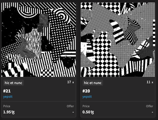
Yepstt is an artist I know almost nothing about, and if I remember correctly I just saw one of their collages and said “oh wow.” If you trace their work back, you can see their first mint to the Hic Et Nunc contract (just general tezos contract now, functionally) was in October ‘21. You can follow their work and tell this is someone who has the financial incentive to really explore their artwork and keeps at it. There’s a flurry of work in different directions, but to me some of their best work begins here in late December with collages like the black and white design below:
You can see on into January some of the styles of compositions I think are their best work coming into existence - and you can still buy some pieces from their back catalogue at really reasonable prices:
Following Yepstt’s work, there’s still a lot of development and experimentation before they get around to creating some objkt collections I’d recommend. The work that first caught my attention was some of these black and white collages that demonstrate a really solid intuition on what-goes-where and contrasting patterns.
I’m going to take a second to talk about a thing I often tell artists asking me about good composition. I don’t think that I’m the master, but I have some ideas about what I think makes things appealing and interesting and what I find dull.
Take for example these two designs:
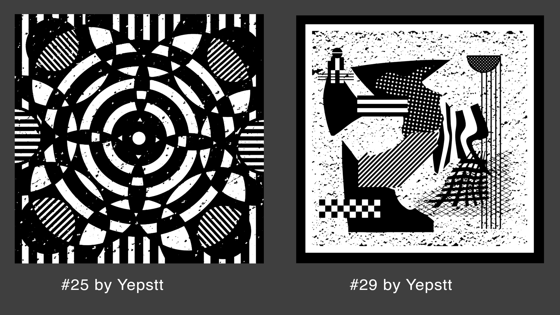
I’ve told lots of different artists (who asked) that their design was boring because it was mostly symmetrical. I yawned when they showed it to me, and I think lots of collectors do the same. The interesting thing is - this isn’t so much about art theory or having really refined tastes: it’s an immediate impression. We like to talk a lot about art appreciation being subjective - and it really is - but you can shout until you’re blue in the face that every artist has the right to make whatever they want and find whatever they want beautiful, but in another style (reminiscent of Ciput) Yepstt uses below you can see the same pattern at work:
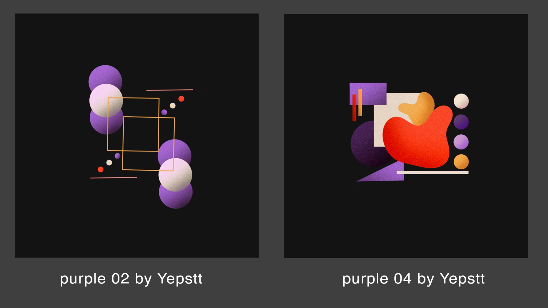
All things being constant - the stippled textures, the palette, the simplicity of the arrangements, “purple 04” just seems undeniably better to me. This is one of those fascinating things about abstract art: it can be as subjective and non-referential as you like, and yet still some things are simply more appealing. At a certain point they’re more appealing to enough people that you’ve got to admit some kind of qualitative difference between one collection of shapes and another.
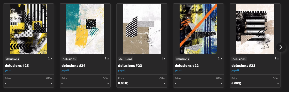
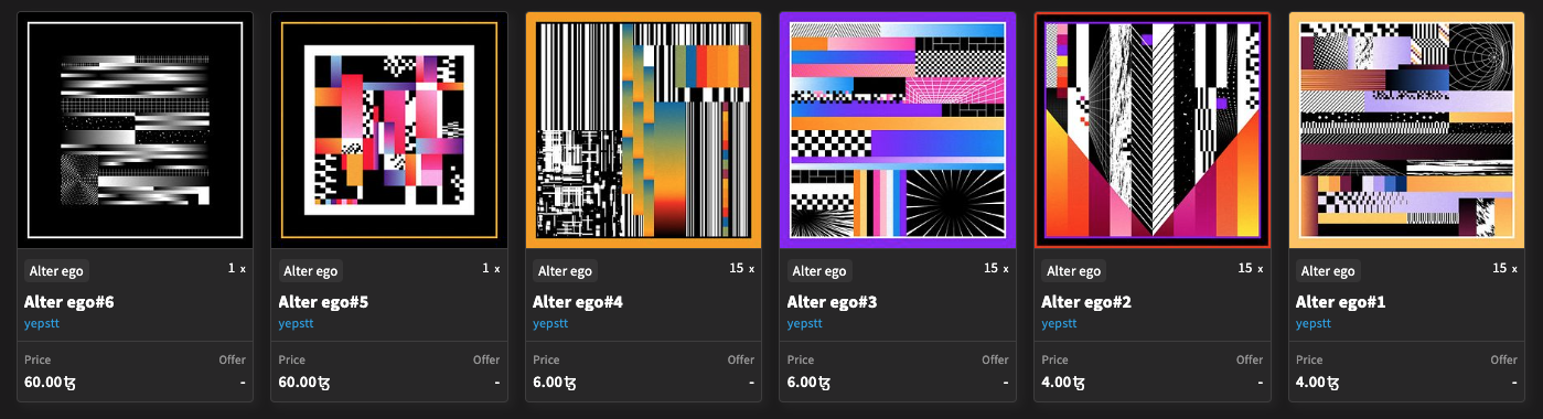
Yepstt seems to be one of those restless souls that tries thing after thing, and I recommend that anyone who likes any of what they see here go through their work on OBJKT and try to find some of the many hidden affordable gems. There’s a whole treasure chest of them laced throughout Yepstt’s work - but if you don’t have the spirit of adventure deep in your heart you can cut to the chase and see several of the really good collection contracts on OBJKT.
delusions: on OBJKT
Alter ego (with Ateliê 407):
Murals: on OBJKT
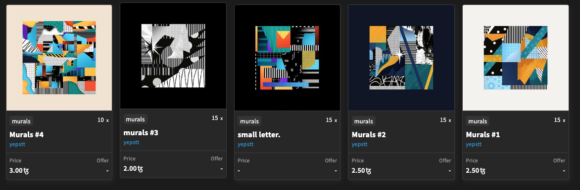
Any one of these collections has great works at dirt cheap prices. What came to fruition by the time Yepstt was working on these recent collections is an apparent general competency at abstract work. Different styles and a prolific output seems like it’s really helped shape a sensibility you just can’t argue with.
3. Pixel_Nachos (aka the_side_hustle)
I met Pixel_Nachos (from here on “PN”) when I saw some of their really raw rainbow-on black retro pixel animations and instead of having a seizure I messaged them about working together. PN says in their descriptions that they’re using grafx2 - a style that I’ve seen some neat work from Sabato in that harkens back to 90’s home PC games I still recall. Sometimes you could get these kind of trashy discount CDs that had 150+ games on them and you could tell just from a few seconds of playing that no executive had ever wandered into the development studio to tell them to tone down the colors or make the in-game visuals more palatable for a real estate office or a coffee break room or something.
Anyways, I worked on a thing with PN and I think we made a nice project together where I composed some of their patterns in arrangements, but what I wanted to really showcase was their really in-your-face animated rainbow work. It’s so immediately pleasant - the best examples of it are also wildly alien and showcase what sosogutter calls “asemic” writing, bricks, little follies and staircases combined with totally 2d abstract spectrums without adornment.


You can just feel the immediate blast of rainbow energy that the_side_hustle stumbled across, and the feeling you get from looking at these is that the only reason PN can hold back from even more full on brain melting dazzle is that the full effect of the rainbow blast works better when it’s framed and contextualized in shapes and settings and patterns. It reminds you of early Windows screensavers that utilized fractals and random color palettes and just generally blew the minds of kids everywhere when their family computer let them peek into the whole spectrum come to life. The whole thing of it is that the_side_hustle takes these blaring waves of color that could overwhelm your brain and make it just cancel your eyes and instead he tames that energy just enough to let us take it in at a heroic pace.
Speaking of break rooms - you can also kind of see that PN established this rainbow and black aesthetic and then gradually branched out a little into slightly altered palettes and set those in place with these wonderful little model studio style designs:


I think this is some of his best work: little rooms that highlight the artifice of presenting a little room where the black and white theme is sometimes flipped upside down to present clean white surfaces again lit with prismatic shapes and decor. It’s thrilling to see how many permutations of the concept produces exciting results, but I don’t think Pixel_Nachos the_side_hustle will be done any time soon, and I hope they keep sculpting these incredible hue-shift serpent demons and virtual apartments of computing past for a while.
Each of these artists is doing work in a really different way, and I’ve begged each to drop a collection on glitchforge.xyz/ondemand. Whether they will or not, I’m going to be here for their art either way - and I hope I’ve managed to sell you on these artists being really impressively talented and worthy of being followed.